Why Aren’t Your Crafts Selling? 9 Fatal Mistakes in Handmade Sales & Practical Solutions
yassy
Crafters!
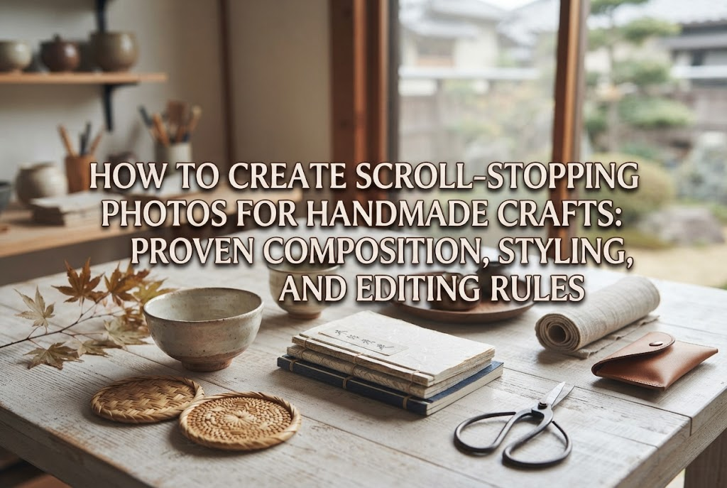

Hello, everyone! This is Yassy from Crafters! (・∀・)
As someone who absolutely loves making, viewing, and shopping for all kinds of handmade crafts, I am pouring all of my photography knowledge into this complete guide on how to make your creations stand out instantly on social media!
Every single day, social media feeds are flooded with an overwhelming volume of photos and videos. If you want people to stop their scrolling, tap on your post, and genuinely feel that "I want this!" or "This is so cute!" spark, simply taking a clean photo is nowhere near enough.
Your photos need visual hooks designed specifically to pause a user's thumb as they breeze through their feed. In this guide, I will break down every essential technique for social-first craft photography in an easy, practical way that beginners can put into practice right away.
Many makers struggle with the frustrating feeling of pouring their heart into a handmade piece, posting it online, and receiving virtually no likes, comments, or clicks. However, this rarely means your craftsmanship is lacking. The real issue is that the way the photo is presented has not been optimized for the social media environment.
Photos meant for online marketplaces or e-commerce storefronts serve a completely different purpose than photos posted to a social media feed.
Marketplace photos (catalog photos) are designed to provide accurate, reliable details. Their job is to convey the exact size, the back side of an item, and true-to-life color reproduction without ambiguity. They are confirmation photos for buyers who are already considering a purchase.
On the other hand, photos on social media exist to move emotions and halt scrolling. For someone casually browsing their feed, a social post needs to instantly convey an inspiring lifestyle experience that triggers thoughts like, "Wow, that's gorgeous!" or "I would love to have that in my life!" If you lead with a standard catalog shot featuring your item isolated on a plain white backdrop, it will instantly be swallowed up and ignored in the fast-moving timeline.
To capture attention on social media, you must shift your mindset from merely "explaining the item" to capturing an evocative snapshot of the attractive world your piece belongs to.
Research suggests that people scroll past photos on smartphone feeds in roughly 0.5 seconds per post. Within that split second, the human brain cannot register intricate details or the meticulous hours you spent crafting. The brain reacts instantly to only three things: color palette, contrast of light and dark, and dynamic composition.
Visual impact does not mean using garish neon colors or unnatural decor. It means establishing a clear contrast between your hero piece and the background, using deliberate negative space and sightlines to pull the viewer's eye straight into the frame. This calculated visual impact is your strongest tool to make a scrolling thumb come to a dead stop.
When you take photos, do you simply point your phone and shoot just to fit the whole item in the frame? Composition follows proven principles that naturally guide the viewer's eyes. Mastering these four layout patterns will instantly elevate your craft photos to a professional standard.
Placing your subject directly in the center of the frame—traditionally known in Japan as the "Hinomaru" (rising sun) composition—is a timeless foundation. When paired with the right styling, it becomes an incredibly striking format for social media.
A common beginner mistake is zooming in too close, filling the entire frame with the item until the photo feels cramped and awkward. The secret to making a centered composition feel sophisticated is leaving bold, intentional negative space around your piece. Keep the item in the middle while surrounding it with a generous, uncluttered border. This empty space acts like a frame, drawing the viewer's focus straight to the center. Styling your background with textured linen or natural wood grain instantly adds an understated touch of elegance.
For small accessories such as earrings and rings, slender objects like pens, or groupings of multiple small items, a diagonal composition works wonders. Arrange your pieces or styling accents along an imaginary diagonal line cutting across the rectangular frame.
A diagonal arrangement introduces both directional flow and depth to an otherwise flat smartphone screen. By highlighting dimension and dynamic movement, your photo gains significant presence in a busy feed. Placing your main handmade piece in the foreground along the diagonal line while gently blurring secondary props in the background creates rich depth, much like a photo shot on a professional DSLR.
For crafts that emphasize delicacy, tenderness, and warmth—such as herbariums, knitwear, embroidery, ribbon work, and floral arrangements—C-curve and S-curve layouts are exceptionally effective. Gently position elements like lace paper, ribbons, or dried floral sprigs along a soft, curved path that mirrors the letter "C" or "S".
Human eyes naturally follow smooth curves. Introducing graceful winding lines into your composition gives viewers a sense of comfort and elegance. Amid the rigid straight lines typical of digital feeds, these flowing shapes stand out clearly and accentuate the gentle charm of handmade work.
Shooting vertically from directly above your setup—often called a flat lay—remains one of the most popular and stylish choices on social media. It instantly creates a polished look reminiscent of an editorial spread in an international lifestyle magazine.
The biggest advantage of a flat lay is the ability to present an entire lifestyle aesthetic in a single frame, rather than just the item alone. Place quality craft tools used during production, seasonal fresh flowers, an antique book, or a favorite coffee cup alongside your finished piece. Showing a bird's-eye glimpse of "life with this handmade creation" sparks aspiration and encourages genuine buying interest.
Just as important as your composition—if not more so—is your image's aspect ratio. Many crafters shoot in a square (1:1) format by default, but on modern social platforms, this misses a major opportunity.
To put it simply: vertical (4:5) photos hold the ultimate advantage in social media feeds. People browse on vertical smartphone screens. When someone scrolls through their feed, a 4:5 vertical photo occupies roughly 1.25 times more screen real estate than a standard 1:1 square photo.
A larger display area means dominating more of the viewer’s visual field. When your craft photo fills the screen, competing posts above and below are pushed out of sight. Because the visual surface area expands significantly, the odds of catching a user's attention and stopping their scroll increase dramatically.
To harness the full impact of vertical framing, set your phone's camera aspect ratio to 4:5 or 3:4 before you start shooting. If you snap a horizontal or square picture and try to crop it into a tall rectangle later, your vertical proportions will look unbalanced, and parts of your subject may get awkwardly chopped off.
Style your scene so that it thoughtfully utilizes both the top and bottom of the vertical frame, creating a cohesive, immersive world. A carefully composed vertical shot functions as an undeniable visual roadblock in any feed.
Optimal dimensions vary slightly depending on the platform. Keep these formatting guidelines in mind:
Across all of these channels, the core principle remains identical: vertical images stand out far better than horizontal ones on mobile screens.
Simply setting your handmade piece on an untreated floor or an everyday table fails to communicate its handmade warmth and craftsmanship. Selecting the right background materials and styling accents requires a clear strategy.
The most critical mistake in styling is overcrowding the scene with so many props that the viewer cannot tell which item is for sale. Decorative props must always remain supporting actors that elevate the main creation.
The ideal visual balance in the frame is 70% hero piece and 30% background and styling props. Furthermore, restrict the total color palette across the entire shot to a maximum of three colors, including your product. For instance, if your hero piece is a soft pink leather pouch, select a clean white cloth for the surface and add just a single cream-colored dried flower sprig. Limiting your palette establishes immediate harmony and makes the product pop.
Customers do not simply buy physical objects; they invest in the joyful moments and feelings that come with owning them. Introducing a small hint of everyday narrative into your image greatly boosts relatability and desire.
If you are photographing a handmade ceramic mug, do not just leave it empty. Fill it with a warm, steaming cafe au lait and place a small plate with a freshly baked cookie beside it. For an embroidered pouch, stage your favorite lip balm and hand cream peeking slightly out of the zipper. Helping viewers clearly visualize how the item makes everyday routines more delightful is the secret to generating genuine interest.
When potential buyers land on your profile page, seeing a unified feed grid dramatically increases your chances of gaining a dedicated follower. The easiest way to achieve visual consistency across your grid is to stick to a fixed background material for all your product shoots.
Instead of switching surfaces for every new release, decide on a signature backdrop: commit to shooting everything on a specific whitewashed wood board, or a muted greige linen fabric. Maintaining consistent lighting tone and background texture ensures that your past posts come together like an elegant boutique lookbook.
Infusing a static photograph with subtle human presence or dynamic motion creates an irresistible visual magnet in a fast-paced feed. Here is how to give your craft photography genuine vitality.
Compelling photos often capture an action right in the middle of happening, rather than an item staged in total stillness.
For a handmade skirt, photograph the hem as it swishes through the air; for a scented candle, capture the moment a match is brought toward the wick; for a tote bag, shoot it as it is lifted onto a shoulder. Suggesting the passage of time encourages viewers to pause and explore the scene a little longer.
The human brain is naturally hardwired to notice human faces and hands. Including a hand or a close-up of a piece being worn around the ear or neck instantly boosts clicks and engagement compared to an isolated product shot.
For jewelry and wearable accessories, photos showing real scale on a body convey proportions far better than a floating piece on a flat surface. When featuring hands, apply a light moisturizer and ensure your skin looks clean and well-tended. Beautifully cared-for hands instantly reinforce the perceived value and quality of your work.
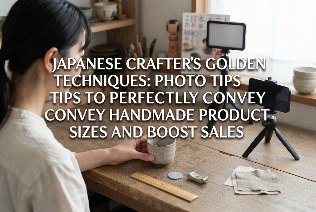
If you work and shoot alone, you never have to give up on lifestyle or in-use photos. By setting up a smartphone tripod paired with your camera's self-timer or an inexpensive Bluetooth remote shutter, capturing clean hand-modeled shots on your own is remarkably simple.
Alternatively, practical props like realistic acrylic ear-display stands or wooden mannequin hands can serve as excellent stand-ins. Using these tools lets you present your pieces worn naturally without the cost or scheduling challenges of hiring models.
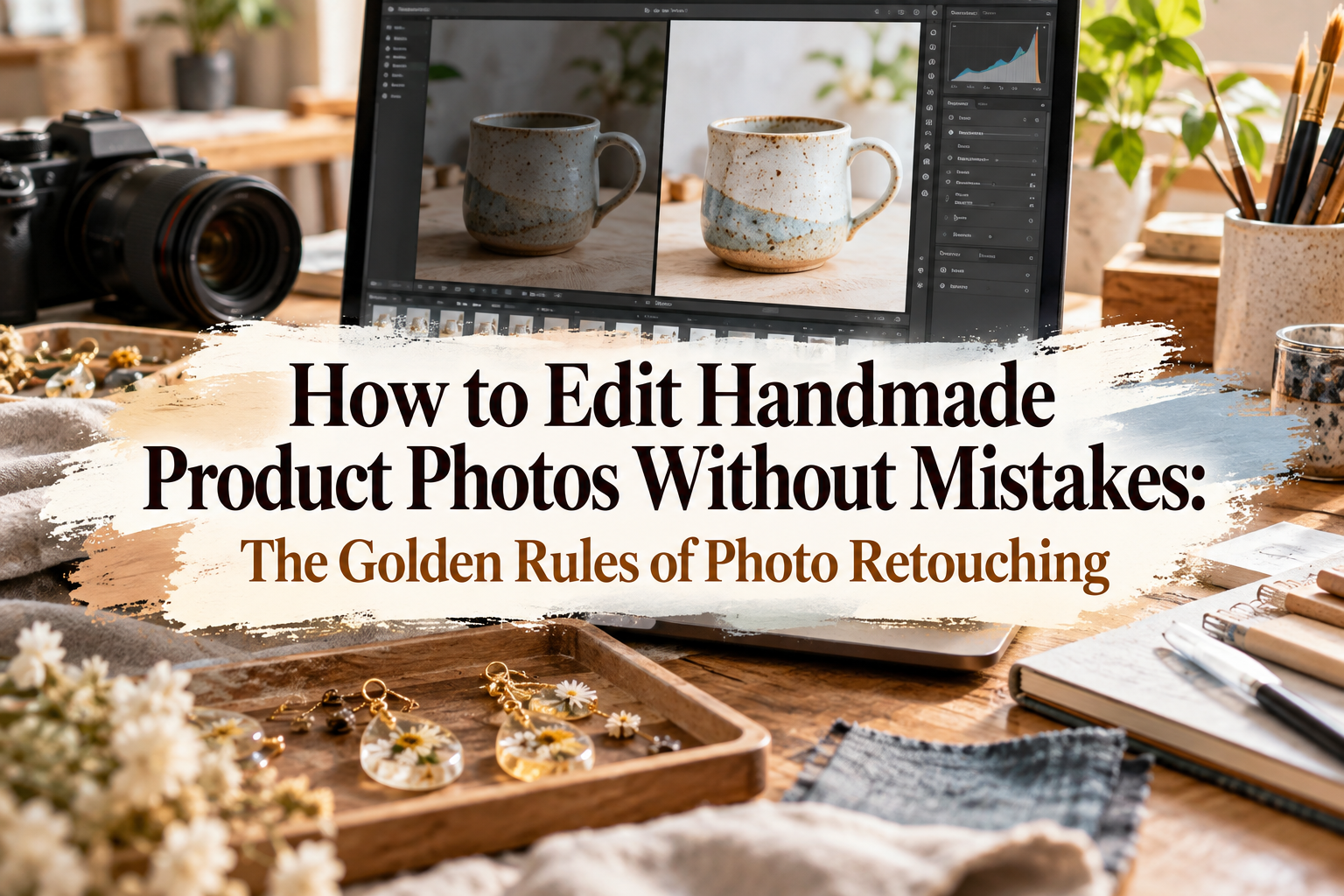
Photos straight out of a smartphone camera often turn out slightly dimmer or less vibrant than real life due to lens limitations and indoor lighting. Never post raw, unadjusted photos directly to social feeds. Thoughtful adjustments using a free photo editing app represent the vital final step in creating eye-catching imagery.
Rather than randomly moving sliders, approach your editing with a reliable baseline. Here are the golden parameter adjustments I personally rely on to bring out the true beauty of handmade work:
Walking through these four adjustments transforms a dim, flat smartphone photo into a radiant, professionally balanced image.
A major editing pitfall is applying a pre-made filter preset at 100% intensity. Overbearing filters alter the true colors of your handmade materials, which can lead to customer disappointment when an item arrives looking different from the listing photos.
If you choose to use filter presets, dial their intensity down to roughly 30% to 40%. The goal is to lend an airy ambiance while preserving the natural colors and genuine textures of your materials.
For fine adjustments, Lightroom Mobile is an exceptional free tool. As a mobile adaptation of professional software, it allows you to refine delicate lighting details without degrading or distorting your craft's natural hues.
Simply adjusting "Shadows up" and "Highlights down" inside the Light panel works wonders to accurately reproduce the crystalline transparency of UV resin, the sparkle of glasswork, or the soft fuzz of yarn and fabric fibers. A free app provides everything you need to dramatically boost your photography quality.
On platforms like Instagram, you will often see feed images featuring text callouts like "New Release," "Limited Batch of 5," or "Hypoallergenic Hardware." Adding text can be a powerful communication tool, but if misapplied, it can seriously cheapen the visual appeal of handmade work.
The decision to include text comes down to the purpose of each specific photo.
Text overlays are best reserved for functional details: demonstrating dimensions, how an item is worn, color variations, or special sale announcements. When functional perks are hard to grasp at a glance, clear text can guide viewers effectively.
Conversely, for your main hero shots—images intended to communicate brand identity, atmosphere, and exquisite craft details—skip text overlays entirely. The moment text is superimposed over a fine piece of art, the image loses its artistic purity and begins to look like an advertisement. The smartest approach is leading with an unblemished, mood-rich hero image on your first slide, and saving text-annotated informational slides for the second or third slide in a carousel post.
If you do place text on a primary image, make sure it never competes with the handmade creation itself.
Choose clean, legible typefaces, such as a crisp sans-serif or an understated, elegant serif. Avoid overly decorative or chaotic novelty fonts, as they become difficult to read on compact mobile screens and will be passed over quickly.
Position your typography inside the negative space you planned during styling. Never overlay text directly across the handmade product. The craft item must remain the undisputed star of the frame, with text serving purely as quiet supporting context.
In this guide, we explored essential principles for producing handmade craft photography that stops the scroll across social feeds.
Let us review the core takeaways:
Capturing breathtaking craft photography does not require high-end studio gear or costly camera setups. With a smartphone, thoughtful composition, intentional lighting, balanced styling, and gentle color correction, anyone can create scroll-stopping photos that shine in the feed.
Think of your social media photography as a love letter sent out to future customers who have yet to discover your work. Capture that 0.5-second showstopper, and share your beautiful creations with craft lovers everywhere!
If you found this guide helpful, sharing it with your creative friends on social media means the world to me. See you in the next article! This has been Yassy from Crafters!


For example, if you are looking for articles about mizuhiki, try searching for "mizuhiki"; if you are interested in tools, try keywords like "nippers" or "pliers."