Japanese Crafting Guide: How to Use Instant Glue Without Blooming or Damaging Materials
yassy
Crafters!

Hello, this is Yassy from Crafters! (・∀・)
When you create a special handmade piece, you naturally want as many people as possible to see it. Photos are the single most critical element when listing your work on online shops or social media. I love photographing and editing my own creations, just as much as I enjoy browsing wonderful photos from other makers and buying pieces that catch my eye.
However, many beginners fall into a massive trap during the photo editing stage. No matter how fantastic your work is, if you edit your photos incorrectly, you fail to convey its true charm. Worse yet, it directly leads to the ultimate customer complaint: "The item I received looks completely different from the photos!"
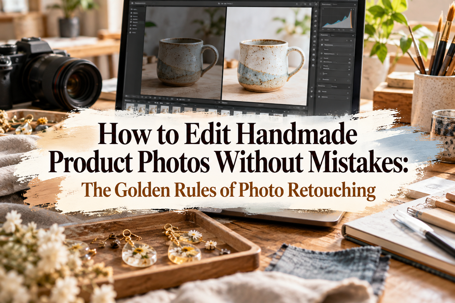
In this article, I will thoroughly explain the absolute "don'ts" of editing handmade product photos, as well as retouching techniques to convey 100% of your work's real charm. Instead of relying on vague instincts, let's finish your photos using clear, definitive rules!
First, it is essential to understand the true purpose of editing photos for handmade crafts. When people hear "editing," some think it means making the item look better than it actually is or hiding imperfections. That is a huge misconception.
The goal of photo editing for handmade products is not to beautify reality, but to restore the charm of the real item that was lost during shooting. Photos taken with smartphones or cameras often end up darker and duller due to room lighting and shadows. Editing is simply the process of bringing that minus back to zero.
We edit photos to accurately deliver the true colors, textures, and delicate details to customers viewing through a screen. If you misunderstand this goal and apply excessive edits to make items look unrealistically stylish, you will raise customer expectations unnecessarily high.
When shopping online, customers rely entirely on photos to make purchasing decisions. If they open the box and feel that "the color is different from the photo" or "the texture looks cheap," they will never buy from your shop again. That is why having proper editing knowledge directly builds your trustworthiness as a maker.
When you open a photo editing app, there are many features that make photos look stylish with a single tap. However, the over-edited look that beginners often fall for dramatically ruins trust in your craft. Here are five specific mistakes you must avoid.
Retro filters that make photos look emotional or cute pink-tinted filters are strictly off-limits. While they might create a stylish atmosphere overall, they completely distort the original colors of your work.
What customers want to know is not a "stylish vibe," but the accurate color of the product itself. Photos where reds become too intense or the image turns dull and yellow completely fail as product photos. As a rule, do not use preset filters—adjust brightness and color tones manually instead.
To make their work look vibrant, some makers push the saturation slider to extreme levels. This is another highly dangerous mistake.
When saturation is cranked up too high, primary colors like red and blue saturate on screen, resulting in unnatural, almost fluorescent tones. Harsh photos that strain the eyes make viewers uncomfortable and completely ruin the natural texture of real materials. Saturation adjustments should always be kept very subtle.
Bright photos look clean and make products stand out. However, if you raise the exposure or brightness too much, white or bright areas lose their outlines and turn solid white—a phenomenon known as "blown-out highlights."
If the transparency of resin, the cozy yarn texture of knitwear, or the delicate details of clay work get blown out, potential buyers will lose all sense of your craft's quality. When brightening a photo, always check whether fine details, stitches, and patterns remain clearly visible.
Avoid cranking up the sharpness slider just because a photo is slightly out of focus.
Excessive sharpening creates grainy noise and makes the outlines of your product look unnaturally harsh and jagged. For fabric or yarn crafts in particular, it ruins the soft, gentle texture and gives a hard, plastic-like impression instead. If a photo is blurry, the best solution is to retake it rather than try to fake it with editing.
Adding digital decorative stamps around the photo or layering heavy sparkle effects during editing should also be avoided.
When there is too much visual information on screen, the customer's attention gets scattered, and your handmade piece loses its place as the star. The main focus of photo editing is always the product itself. Light and color corrections are all you need; decorative stamps and flashy effects are entirely unnecessary.
Now that we have covered the common mistakes, let's go over the exact procedure for editing. When you open a photo editing app, there are basically only three settings you need to touch: Brightness (Exposure), Color Temperature (White Balance), and Contrast. Once you master these three, anyone can create beautiful, true-to-life product photos.
Color temperature has the single biggest impact on the impression of a photo. Photos taken under indoor fluorescent lighting tend to look bluish, while those taken under warm incandescent bulbs turn yellowish.
First, remove this unwanted color cast. If the image looks blue, move the color temperature slider slightly toward the warmer (yellow) side. Conversely, if it looks yellow, slide it toward the cooler (blue) side. The absolute standard is to adjust until a white paper or wall in the background appears as a pure, neutral white on your screen.
Once the colors are balanced, adjust the overall brightness. Raise the exposure or brightness slider to create a clean, bright impression.
A professional tip here is not just brightening the whole image, but specifically lifting the "Shadows" slider slightly. If shadows are pitch black, the back or sides of your product become hard to see. By lifting shadows, details in dark areas emerge clearly, accurately showing the structure of your piece to buyers.
Here is one crucial point every beginner needs to know: your smartphone screen brightness setting. If your screen is set to dark, you will unconsciously over-brighten your photo edits.
When editing, turn off automatic brightness adjustment and fix your screen brightness at around 70% to 80%. Most importantly: place the actual product on your desk and compare it side-by-side with your smartphone screen while editing.
If you only look at the photo on screen, your eyes will quickly adapt and fail to notice color shifts. Placing the real item next to you and constantly checking back and forth—asking "Is this red identical to the real thing?" or "Does this shine match reality?"—is the only foolproof way to prevent color mismatch disasters.
Just as important as color and brightness is correcting the shape and composition of your photo. Due to camera lens characteristics, smartphone photos tend to distort near the edges.
If a product is a neat square or circle in real life but looks like a distorted trapezoid in the photo, the careful craftsmanship of your piece won't come through. Make sure to fix compositional distortion during editing.
Even if you intended to take a shot straight from above or directly from the front, photos are often tilted by 1 or 2 degrees. A tilted photo gives viewers a subtle sense of instability and amateurishness.
Use the straightening or perspective correction tools in your editing app so that background grid lines or straight edges of your product align perfectly parallel and perpendicular to the photo frame. This simple step dramatically elevates the polished feel of your photos and your entire shop.
On handmade marketplaces and social media, unifying the aspect ratio of your photos is vital. Generally, a 1:1 (square) or 4:3 ratio is standard.
When cropping, leaving adequate negative space around the item is essential. If the product is crammed right up to the edges of the frame, it feels suffocating. On the flip side, if the product is too small, buyers won't easily see what is being sold.
For your main cover photo, crop so that the product occupies roughly 60% to 70% of the total frame—this creates the most visually pleasing balance.
Some makers take a wide shot and crop a tiny portion to create a close-up photo, but you must be careful with this practice.
Cropping a small section from a wide photo lowers the pixel count, making the final image grainy and blurry. If you need a close-up detail shot, bring the camera closer to the product while shooting to capture it in high resolution rather than forcing a heavy crop during editing. Forced cropping destroys image quality.
You may sometimes want to add your brand logo or text information like "Multiple Sizes Available" or "Free Shipping" onto your product photos. There are clear rules to follow here as well.
Text is supplementary information; it is never the hero. Here are key precautions to keep text from detracting from your craft's appeal.
This may seem obvious, but when caught up in placing text, some makers accidentally overlap words onto jewelry clasps, bag stitching, or intricate clay patterns.
Customers want to inspect every detail before buying. Always place text in empty background spaces where the product isn't present. If text must overlap the item, lower the opacity to make it subtle or shrink the font size as a matter of good practice.
The fonts you choose for text overlays are also vital. Using overly quirky fonts or flashy decorative hand-drawn styles can strip away the refined feel of your work.
Stick to highly legible, clean fonts such as basic sans-serif or serif styles. Furthermore, if text is too large, the image instantly looks like a loud advertisement, diluting the warmth and premium quality unique to handmade items. Keep text at a modest size that is easily readable without being overbearing.
Here is the exact step-by-step process I use when retouching photos of my own craft creations. Once you get used to it, editing a single photo takes only about 2 to 3 minutes. The key is to process systematically following a set routine rather than lingering endlessly.
You don't need expensive specialized software. Free features in popular apps like Lightroom or Photoshop, or even built-in editing features on your smartphone, are more than enough to accomplish the task.
Following this sequence every time prevents inconsistent edits and ensures a beautiful, unified shop page no matter which photo a buyer views.
In online stores and gallery pages, photos are displayed side-by-side in a grid. If each photo varies wildly in brightness or color tone, the entire shop looks cluttered and unorganized.
If the first photo looks warm and yellow, the second looks cold and blue, and the third is dark, it creates uncertainty for prospective buyers. To convey that your brand builds things with care, unifying the overall tone and visual world of your shop is essential.
For photos taken in the same location under identical lighting, apply matching edit parameters (e.g., Brightness +10, Color Temp -5). Most image editing apps allow you to copy settings from the first photo and batch paste them onto others. Take advantage of these features to maintain strong overall harmony effortlessly.
We have covered many essential guidelines for editing handmade product photography. Let's do a quick recap of the core takeaways:
The single most crucial aspect of photo retouching is maintaining an honest approach aimed at accurately reproducing the real item. Excessive filters, blown-out brightness, and wild saturation destroy the real charm of your work and damage customer trust.
By sticking to these rules, your photos will transform into clean, attractive, and above all, trustworthy product photography that converts views into sales. Editing isn't about disguising your work—it is the bridge that conveys the true craftsmanship you poured into your creation directly to distant customers.
Master these proper retouching techniques and share your incredible crafts with the world with confidence! I'm cheering you on!
If you found this helpful, sharing this article with your fellow crafter friends on social media would mean the world to me!
Until next time, this was Yassy from Crafters!




For example, if you are looking for articles about mizuhiki, try searching for "mizuhiki"; if you are interested in tools, try keywords like "nippers" or "pliers."