What Is Macrame? A Japanese Crafter’s Guide to Projects, Difficulty, Cord Choice, and Startup Costs
yassy
Crafters!

Hello, fellow makers! It’s Yassy from Crafters! (・∀・)
As you dive deeper into macrame knotting, have you ever run into creative roadblocks like these?
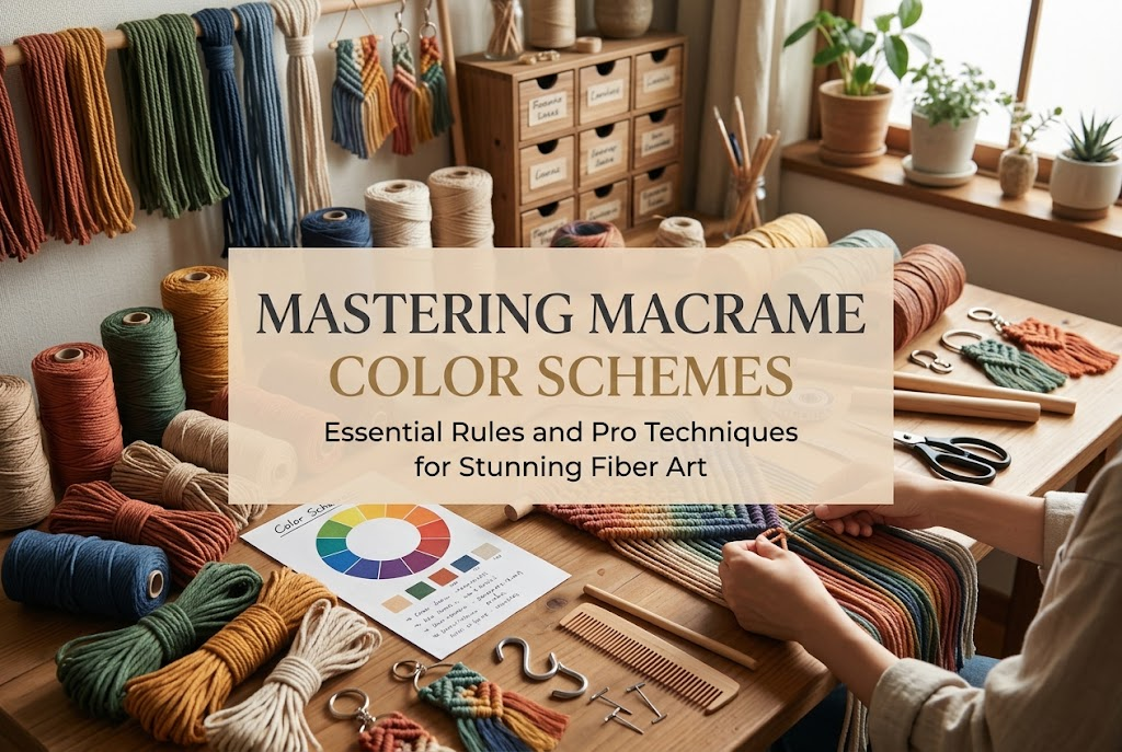
Struggling with color selection is a challenge that almost every macrame enthusiast encounters at some point. Personally, I make various handmade items all the time, and I love admiring and shopping for gorgeous fiber art at exhibitions and online shops. Among all fiber crafts, macrame has a unique depth: the way colors interact changes drastically depending on cord choice and knot structures.
Fortunately, choosing a color scheme for macrame isn't just a matter of guesswork or random intuition—there are clear, reliable design principles you can follow. By mastering these rules, your projects will instantly take on a refined, professional finish. Let's break down the fundamentals of macrame color design so you can pick your palette with total confidence!
Choosing colors for macrame requires a completely different mindset than picking paints for a flat canvas or selecting fabric prints for sewing. Macrame pieces are three-dimensional sculptural structures built by tying cord knot by knot. Because of the shadows and intersections created by those knots, identical hues appear completely different in practice than they do on a flat color swatch.
If you rely solely on two-dimensional color intuition, your finished project will rarely match your initial mental image. Understanding how structural knots interact with color is the single most important key to avoiding disappointment.
In flat illustration or surface design, visual effects are generated simply by placing colors side by side. In macrame, however, cords twist and overlap, creating alternating ridges (peaks) and indentations (valleys). The play of light and shadow naturally intensifies the contrast between lights and darks.
Because of this, knotting two highly saturated, vivid colors directly next to each other creates harsh contrasts that can be visually jarring. On the other hand, combining muted "dusty" tones creates sophisticated depth and elegance as the shadows soften the transitions. You must always anticipate how the three-dimensional texture of the knots will affect your hues.
Monochrome macrame made entirely with natural, unbleached cotton cord is a timeless classic. It highlights the raw, organic texture of the fiber and showcases the crisp geometry of your knot patterns. It effortlessly blends into almost any home decor style and carries very little risk of aesthetic failure.
However, incorporating two or more colors allows you to introduce seasonal moods and express an artistic narrative. A pop of color can transform a simple wall hanging into a striking focal point or turn an everyday bag into a trendy accessory. As long as you maintain the right ratios and placement, multicolor palettes will significantly elevate the visual value of your handmade work.
You don't need an advanced degree in color theory to create stunning macrame. Keeping these three simple, foundational rules in mind will help anyone craft a well-balanced piece.
When working with multiple cords, the proportion of surface area each color covers is everything. In macrame design, the golden ratio is typically 70% to 80% for your main base color, and 20% to 30% for your accent color.
For example, you might knot 80% of a wall hanging in natural ivory, using a warm terracotta tone for only the remaining 20%—perhaps across a central geometric motif or along the bottom fringe. Keeping this balance prevents visual clutter and pulls the entire piece together cohesively. Splitting colors equally 50:50 tends to divide the viewer's focus and makes the composition feel clumsy, so avoid an even split whenever possible.
If you feel unsure about color harmony, a tone-on-tone (monochromatic) gradient is your safest and most elegant bet. Simply select two to three shades from the same color family that vary only in lightness or saturation.
Here are a few reliable examples:
Tonal gradients flow seamlessly across intricate knots, producing a chic, upscale look. This approach carries virtually zero risk of clashing while instantly giving your work an experienced, designer touch.
When you want to make an eye-catching statement or channel an upbeat bohemian vibe, look to complementary colors—hues situated directly opposite each other on the color wheel. Dynamic pairings include mustard yellow with navy, or terracotta with turquoise.
The secret to pulling off contrasting colors without eye strain is to avoid pairing two intensely bright shades together. Lower the saturation of one or both tones into a muted or dusty version. Pairing a grounded navy with a mellow, antique mustard produces a warm, stunning ethnic-boho look that feels polished rather than overwhelming.
Different macrame knots expose cords differently. Knowing where each color will appear across various techniques is essential when planning your design.
Fundamental macrame knots—such as the square knot and the half-knot spiral—consist of stationary core cords (filler cords) and active tying cords (working cords). A common beginner mistake is overlooking that the color visible on the surface of a square knot comes almost entirely from the working cords. The filler cords remain hidden inside, barely peeking through the gaps.
If you want a specific color to dominate a section of square knots, assign that color to your working cords. Conversely, if you want subtle hints of color to peek through from beneath, tucking a vivid hue into the filler position is a brilliant hidden-layer technique. With spiral knots, because the knots twist along an axis, alternating colors create a dynamic, barbershop-pole stripe effect.
Techniques like diagonal and horizontal clove hitch knots (double half hitches) allow you to sketch crisp geometric shapes, chevrons, and diamond patterns into your tapestry. If your goal is to make these patterns pop, establishing strong value contrast between the background and the motif is non-negotiable.
If your background cord is natural ecru, use a dark brown, deep forest green, or charcoal for the knot lines. If the contrast is too low (like combining ecru with very pale beige), all your hard work knotting intricate motifs will vanish from a distance.
If managing multiple colors throughout the body of your knotting feels intimidating, the easiest and most effective workaround is introducing accent colors purely at the borders or fringe. Knot the main body entirely in a neutral base, and introduce your second color only when attaching lower fringe tassels.
You can also knot separate macrame feathers or leaf motifs in an accent color and tie them along the bottom hem of an ivory wall hanging. This introduces rhythmic contrast without interfering with the technical structure of the main piece.
Color choices cannot be separated from material texture. The exact same shade of pink will read completely differently on cotton cord compared to polyester cord. Overlooking texture will lead to unexpected results once your project is off the dowel.
Cotton cord—the staple of traditional macrame—features a matte, light-absorbing surface. Because of this, it diffuses light softly, yielding organic, gentle tones that pair naturally with home interiors and boho fashion. Even saturated cotton dyes take on a calm, grounded appearance.
Synthetic cords like polyester or nylon feature a distinct sheen and deliver crisp, vibrant color payoff. When making paracord outdoor gear or modern, urban micro-macrame jewelry, this subtle gloss imparts a sleek, contemporary feel. Match your cord's fiber properties to the ultimate mood and function of your project.
Muted shades—such as smoky rose, sage, muted mustard, and greige—are consistently popular. These dusty, gray-tinted hues harmonize effortlessly with one another, making them practically foolproof for beginners.
However, if an entire piece is made exclusively of dark, dusty tones, it can appear muddy or heavy under dim interior lighting. The fix is simple: always include a touch of warm off-white or natural ecru as a "breathing space." That light neutral acts as a visual palate cleanser, brightening the entire palette and making your dusty shades shine.
Adapting your palette to the seasons keeps macrame exciting year-round. Here are four go-to palettes I regularly use in my own studio:
To avoid guesswork, here is the exact step-by-step workflow I follow whenever I design a new macrame piece:
Before cutting a single cord, pinpoint exactly where and how the finished item will live. Will it hang against a white wall in a living room, serve as a plant hanger by a window, or function as a keychain on a black canvas tote?
You never want your piece to blend into its background and disappear. If it will hang against a dark wood wall, choose a light ecru base. If it's going onto a stark white wall, a rich mocha or terracotta base will stand out beautifully. Work backward from the display environment to pick your primary base color.
Never rely solely on how colors look sitting side-by-side as wound spools. Cords look dramatically different once twisted, stretched, and pulled tightly into dimensional knots where shadows take effect.
I always take 30 cm scrap pieces and knot a quick test swatch—just a few rows of square knots or clove hitches. It takes less than five minutes, but seeing the interaction between adjacent tones in real life completely eliminates the heartbreak of finishing a large project only to realize the colors clash.
Macrame pieces often feature wooden beads, brass hoops, or driftwood dowels. Make sure to treat these hardware components as active players in your color scheme.
Pale natural birch beads blend seamlessly with warm ivory and beige cords. If you opt for dark walnut beads or black matte rings, incorporate a coordinating dark tone into your knotting to anchor the hardware so it doesn't look disconnected from the textile.
Encountering color issues is a natural part of the learning curve. If a project feels off, you can usually correct course with these easy adjustments.
It's tempting to incorporate four or five gorgeous spools into one project, but overloading hues almost always produces a chaotic, unfocused result.
The Fix: Cap your palette at three colors per project: one main base, one secondary support, and one accent tone. If you want more visual variety, expand through tonal lightness (different shades of the same base color) rather than introducing new hues.
Tying saturated contrasting cords (like pure primary red and royal blue) in rapid alternation exhausts the eye and actually obscures the geometric beauty of your knots.
The Fix: Use a solid color for the cord that builds the intricate knot pattern, and let contrasting tones remain in the background or along the fringes. This clear division of roles lets both the color and your knot craftsmanship shine.
We've all ordered cord online only to discover that the physical spool is much darker or brighter than the product photo on screen. Don't let that cord collect dust!
The Fix: If the hue is too loud, hide it as a filler core inside square knots, or use it for hidden structural ties on the backside of a wall hanging. You can also hold the bright cord together with a strand of natural unbleached cotton and knot them as a pair—the neutral fiber will soften and tone down the brightness, yielding a gorgeous tweed-like effect.
Color selection is one of the most exciting aspects of macrame, directly shaping the emotional atmosphere of your work. You don't need to overcomplicate it.
Start by leaning on the 70:30 golden ratio, try out soothing tonal gradients, or brighten up dusty tones with a touch of ivory. When you make quick scrap-testing a regular habit, your finished pieces will consistently match your creative vision.
Infuse your unique palette into every handcrafted knot, and enjoy creating one-of-a-kind fiber art! If you found these tips helpful, please share this guide with your fellow makers. Happy knotting, and see you in the next post—from Yassy at Crafters!


For example, if you are looking for articles about mizuhiki, try searching for "mizuhiki"; if you are interested in tools, try keywords like "nippers" or "pliers."