[Beginner’s Guide] How to Start Japanese Needle Felting: Essential Tools, Kits & Zero-Fail Techniques
yassy
Crafters!
Hello crafters, it's Yassy from Crafters! (・∀・)
Whether I'm making handmade items myself, admiring beautiful pieces in galleries, or shopping from my favorite independent creators, I truly love all things handmade. Looking at countless online shops every single day, there is one thing I am absolutely certain of:
Successful, high-selling handmade artisans without exception have flawless brand cohesion and shop design.
No matter how high the quality of your craft is, if your shop presentation is disjointed and lacks unity, it simply won't leave a lasting impression on shoppers. The moment someone lands on your store, if it looks amateurish, cluttered, or confusing, you lose potential buyers right then and there.
On the flip side, brands that maintain a coherent visual identity across their logo and shop design instantly communicate their unique aesthetic. It multiplies the perceived value of your handmade work and builds deep trust, making visitors think, "I really want to buy from this artisan!"
In this guide, I will share all the practical techniques and insights I've developed over the years—from crafting a signature logo that serves as the face of your brand, to overall shop curation and achieving seamless visual harmony. Let's explore the essential rules to help even complete beginners build professional-grade brand design without feeling lost!
In the world of selling handmade goods, maintaining a unified visual identity isn't just about "looking pretty." It is a decisive factor that directly drives sales.
When customers browse items on online marketplaces or social media, they don't just see individual product photos. Subconsciously, they absorb the shop's atmosphere and the artisan's dedication. A cohesive storefront immediately conveys professionalism and intentional craftsmanship.
Here are three key advantages you gain by establishing visual consistency:
A shop without a cohesive identity often feels like a disorganized flea market stall. When that happens, even breathtaking crafts risk being viewed as cheap homemade goods. Designing a unified logo and shop front is essentially building a beautiful frame worthy of your artwork. Take a close look at your shop today and elevate it into a polished, memorable brand.
Beginners who struggle with storefront aesthetics almost always fall into the same traps. It isn't a lack of innate artistic sense; rather, it happens because they start designing without establishing clear rules first.
Here are the three most common pitfalls. Check your own shop carefully to see if any apply to you:
The most common mistake is overloading the shop with a chaotic palette. Using multiple personal favorite colors or photographing every single item against entirely different colored backgrounds creates visual noise. The more colors you introduce, the more distracted the viewer's eye becomes, drowning out the actual craft. In branding, adding excess colors is almost always a risk.
Are you using different typefaces across your banner image, listing photo captions, business cards, and social media graphics? Mixing rounded sans-serifs, traditional serifs, casual handwriting fonts, and flashy display text introduces visual clutter and shatters your brand tone. Typography acts as your brand's "tone of voice." Just as you wouldn't trust someone whose voice drastically changes every sentence, inconsistent typography chips away at customer trust.
A disconnect between your craft's aesthetic and your store's graphic design is another serious issue. For instance, if you craft delicate, antique-inspired glassware, but your logo and shop banner feature vibrant, neon, pop-style graphics, visitors will feel an instant sense of dissonance. This aesthetic clash drives away your ideal target audience.
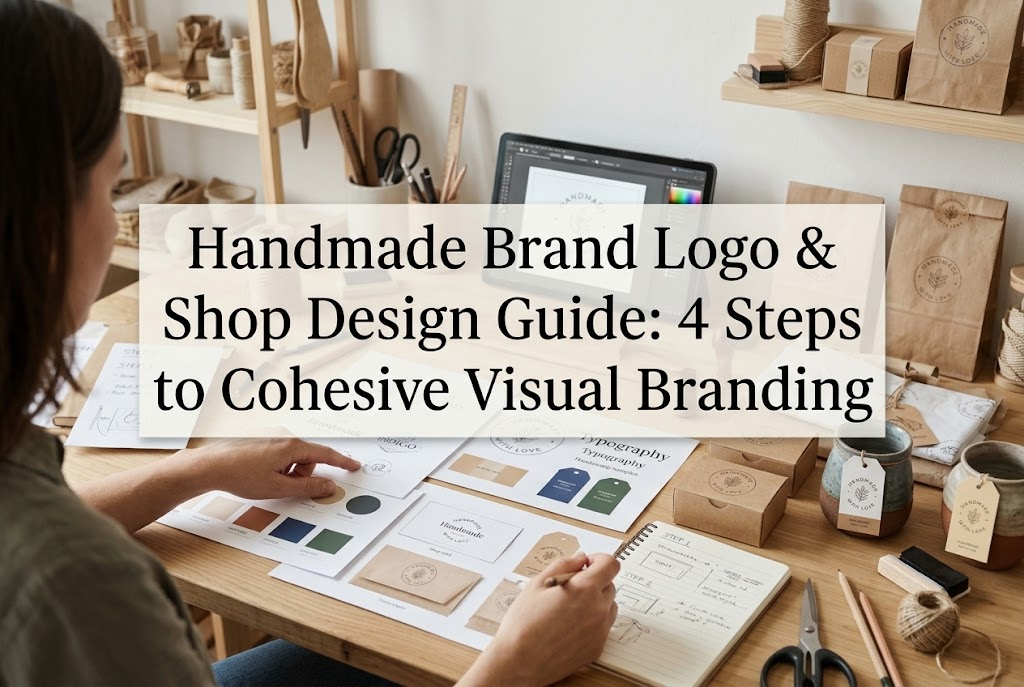
A strong brand aesthetic isn't built on random whim or guesswork. Follow these structured steps, and anyone can build a refined, sophisticated storefront. Here is the 4-step framework I rely on to establish brand cohesion:
Before jumping into any graphic software, you must put your brand concept into words. Skipping this step is like building a house without pouring the foundation.
Start by writing down three core keywords that define your brand identity. For example:
Select terms that capture the essence of your craft. Next, define your target customer (persona) with clarity: what kind of person are they, and in what moments do you envision them enjoying your creations?
My personal approach is to open a notebook or digital canvas and create a mood board by gathering images of interiors, fashion, textures, and landscapes that reflect the ideal mood of the brand. Compiling visual inspiration into a single board keeps your creative direction firmly grounded.
Once your concept is locked in, establish your color palette. Don't choose colors on a whim; narrow it down to three specific roles. In visual design, the 70:25:5 golden ratio is widely recognized for creating balanced, pleasing compositions. Apply this rule strictly to your shop layout and marketing materials:
Keep your main color to one hue, or at most two shades within the same family. Mixing unrelated colors like pink, blue, and green dilutes your presence. If you're unsure, opting for dusty tones or soft, muted neutral hues will instantly give your shop a contemporary, upscale feel.
Typography heavily influences the perceived quality of your brand. As a golden rule, limit yourself to no more than two typefaces across your entire brand: one primary font for English text and one complementary font for secondary text (or Japanese text, if you incorporate Japanese writing).
Choose a style that matches your concept:
Once chosen, use these exact fonts across every medium: your shop banner, listing overlays, social media posts, business cards, and packaging notes. Consistent repetition is what firmly ingrains your brand into shoppers' minds.
Now, create the emblem of your brand: your logo. When beginners design a logo, they often overcomplicate it with excessive decorations and illustration details. An exceptional brand logo should always be simple and instantly recognizable across any medium.
Follow these essential logo design principles:
User-friendly design platforms like Canva offer great starting points. Pick a clean template aligned with your concept, swap in your designated brand fonts and palette from Steps 2 and 3, and you will have a clean, professional logo in no time.
Even with a beautiful logo and brand banner, inconsistent product photography will ruin your storefront. When buyers visit an online marketplace like Etsy, minne, or Creema, or click onto your independent web store, the first thing they see is a grid of product thumbnails.
Use these photography habits to make your gallery look cohesive and captivating:
Use the same background texture and material across your core listings. If you use a rustic wooden board, photograph all your primary listing shots on that surface. If you use a clean white marble slab or neutral paper, stick with it. Switching from wood to pink fabric to black acrylic between listings makes your gallery look haphazard.
Personally, I keep two consistent styling boards that fit the brand aesthetic (such as a textured plaster board and a subtle neutral paper board), using one as the primary backdrop and the other for secondary supporting shots.
An overlooked reason behind uneven shop feeds is varying light quality. Mixing crisp morning sunlight with golden afternoon glow or artificial indoor yellow lighting creates jarring tonal shifts. Always shoot near a bright window with diffused, indirect natural daylight (backlit or side-lit), and aim to photograph around the same time of day whenever possible. Uniform lighting is key to a professional shop presence.
Pay attention to framing. Placing an extreme close-up right next to a distant, wide-angle shot creates visual imbalance across your product grid. Establish a standard formula for your primary thumbnail images: the position of the piece, the amount of surrounding negative space, and your camera angle (e.g., straight flat-lay or a 45-degree angle).
Brand cohesion shouldn't stop at the computer or phone screen. When a customer receives their order, unboxing it should feel like an extension of your creative world.
Design your package inserts, shop cards, and thank-you notes using your designated brand colors, fonts, and logo. Pay attention to paper stock as well. Instead of standard glossy photo paper, consider thick matte cardstock, textured textured fine art paper, or Japanese washi-style craft paper that matches your aesthetic. Tactile sensation is part of design.
Incorporate your visual identity into your shipping supplies—whether through boxes, mailers, ribbons, or sealing stickers. Custom printed shipping boxes can have high minimum order quantities, but placing a custom sticker featuring your logo onto a plain, high-quality box immediately gives it an artisan boutique feel.
I also highly recommend having a custom rubber stamp made with your shop logo. Stamping it neatly onto plain kraft paper wrap, small linen pouches, or thank-you cards is an affordable way to add handcrafted character to your packaging.
Once you finish your logo and shop aesthetic, the most important task is sticking to your established rules. Many makers break their own visual consistency simply because they get bored or impulsively buy new decorative fonts and trendy materials.
To prevent this, put together a simple one-page "Brand Style Guide" containing:
Every time you create a new listing thumbnail, post a promotional announcement, or reorder packaging supplies, consult your guide. This disciplined consistency is what transforms an ordinary handmade hobby into an unmistakable, cherished brand.
Developing a cohesive identity across your logo, shop interface, and packaging is far more than mere decoration. It is your most powerful tool to communicate the care, passion, and artistic integrity you put into your handmade work.
Remember these core takeaways:
Revamping your shop design may take a bit of effort at first, but following these steps one by one will build an inviting space that does justice to your creations. Seeing your handmade pieces lined up inside a thoughtfully curated storefront is incredibly rewarding—and your customers will feel that difference immediately.
Grab a notebook, write down your brand's three defining keywords, and start shaping your storefront today! I'm cheering on your creative journey as your handmade brand grows.
If you found this guide helpful, please share it with your fellow makers. See you in the next article—this was Yassy from Crafters!


For example, if you are looking for articles about mizuhiki, try searching for "mizuhiki"; if you are interested in tools, try keywords like "nippers" or "pliers."