How to Choose and Use Precision Glue Nozzles: Achieve Clean, Zero-Overflow Craft Bonding
yassy
Crafters!
Hello, everyone! It’s Yassy from Crafters! (・∀・)
Have you ever collected a bunch of adorable embellishments, gotten ready to decorate a smartphone case or pillbox, and then thought, "Wait, why does this look cluttered and cheap?" or "I just put my favorite colors together, but the whole design feels messy and disjointed"? If so, you are definitely not alone!
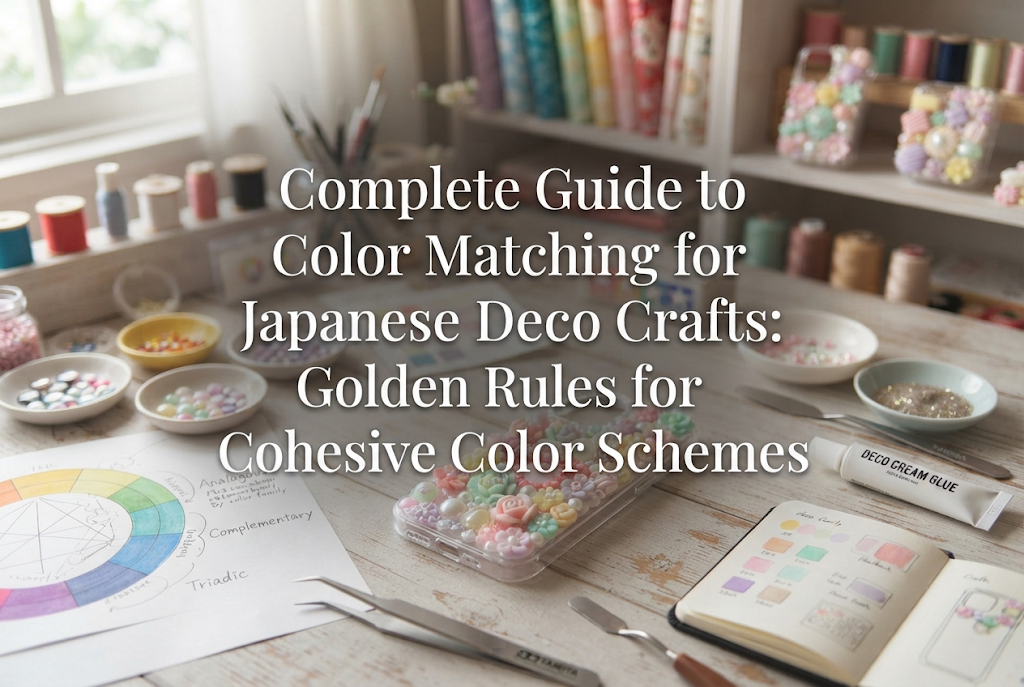
Deco craft—a popular trend in Japanese DIY culture involving embellishing items with rhinestones, bijou stones, resin charms, and pearls—is surprisingly tricky when it comes to color choices. Even when every single charm or stone looks gorgeous on its own, bringing them together on one base can cause colors to clash or make the overall design look muddy and washed out. But here’s the good news: mastering color coordination for deco craft doesn’t rely on raw intuition alone. There are clear rules and practical tips to guide you!
In this guide, I’m going to share the golden rules of color theory tailored specifically for deco crafts, covering everything from fundamental color ratios to matching textures and base surfaces. If you ever feel stuck choosing colors for your projects, keep reading!
Unlike painting or sewing fabric crafts, color matching in deco craft has a unique set of challenges. You cannot mix paints to tweak a shade; you have to work directly with the fixed, pre-made colors of your embellishments and rhinestones.
On top of that, deco craft introduces two additional variables: texture and light reflection. For instance, even within the single color category of "pink," a transparent clear rhinestone, a lustrous pearl, a matte plastic piece, and a glittery resin charm will impact the viewer's eye in completely different ways.
If you ignore these elements and simply decide to use every pink charm you own, the random reflections and clashing textures will leave your project looking scattered and unpolished. This is the single biggest reason why deco craft colors lose cohesion.
Before jumping into the rules, let’s look at three mistakes beginners frequently make. Identifying where your design might be going off track is the fastest way to elevate your work!
When you feel unsure about color balance, try applying the classic 3-color ratio rule to your deco craft design. Memorizing this ratio allows anyone to create a clean, professional look similar to finished items sold in artisan boutiques.
In terms of deco craft materials, use small filler rhinestones or pearls in your Base Color for 70% of the area. Use mid-sized charms and focal pieces in your Assort Color for 25%. Finally, place a single striking bijou stone or charm in your Accent Color right in the center or focus area for that final 5%.
For example, if you want to create an elegant white-and-pink design: set your Base Color to white and clear stones (70%), your Assort Color to a soft baby pink (25%), and your Accent Color to a single deep rose pink or gold gem (5%) in the center. This prevents pink from overpowering the piece and leaves you with a refined, sophisticated finish.
Now that you know the golden ratio, here are three foolproof classic color combinations you can try right away.
This pattern has the lowest chance of failure and yields beautiful results for everyone. Simply choose one single color family and select embellishments in varying shades (tints and tones) of that color.
For blue, you might choose light blue, sky blue, and navy. For purple, lavender, mauve, and deep purple work wonderfully together. Because the hue remains consistent, charms of different shapes and sizes will naturally harmonize. Arranging them so the shades darken from top to bottom or from the center outward creates a stunning sense of depth.
This technique combines colors that sit next to each other on the color wheel, such as pink and purple, blue and mint green, or yellow and orange.
This pairing provides more vibrancy than a monochromatic palette while keeping the overall tone cohesive since the colors belong to similar families. It’s perfect for whimsical, fairy-kei-inspired designs or fresh spring/summer items.
This approach pairs colors positioned directly opposite each other on the color wheel, such as blue and orange or purple and yellow. Complementary colors highlight and intensify each other.
However, using a 50/50 mix of complementary colors in deco craft can visually overwhelm the viewer. The secret to success here is using the main color for 90% of the surface and applying the complementary color sparingly—such as a single small rhinestone or a delicate accent bow.
The major difference between 2D artwork and 3D deco craft is depth and material texture. In deco craft, how a color presents itself changes drastically depending on the material it's made of.
Transparent glass rhinestones and acrylic pieces catch light and sparkle, making their color appear lighter and brighter. On the other hand, resin clay charms and opaque plastic stones (often called milky stones in Japan) display solid, bold colors that demand strong visual attention.
Covering a surface entirely with opaque charms can result in a heavy look, whereas using only clear stones can cause shapes to lose definition under bright light. A great balance is placing opaque main charms in the center and scattering matching clear rhinestones around them to achieve both clarity and sparkle.
Metal charms, spacer beads, and pointed-back gem settings are staples in deco craft, and their metallic tones influence the visual "temperature" of your project.
Mixing gold and silver metal fittings in a single project can disrupt visual unity. Unless you have a specific artistic concept that calls for mixed metals, stick to one metal tone per piece—gold with gold, or silver with silver.
If you ever feel that two charm colors are clashing or that the boundary between colors looks harsh, pearls and aurora-finished (AB) stones are your best friends!
White or off-white pearls act as a universal buffer, softening sharp color transitions when placed between bold shades. Aurora-coated stones reflect ambient light and neighboring colors, creating a subtle, natural gradient that bridges disparate elements seamlessly.
The item you are decorating serves as the background for your work. Here is how to pick embellishments according to the base surface type:
Clear phone cases are extremely popular in Japanese deco craft, but remember that the surface underneath (the color of the phone or table) will show through.
If you use only pale translucent charms on a clear base, the dark color of a smartphone might show through and erase your design. When using a clear base, consider painting a thin layer of glitter resin underneath or using opaque milky stones as your primary pieces so colors stay vibrant.
White or cream bases show off the original colors of your charms most accurately, making them the easiest base choice for beginners.
While white bases accept almost any color, using only pale charms can cause the outer edges of the design to wash out when viewed from a distance. Add a few slightly darker charms or outline key sections with gold metal beads to crisp up the edges.
Dark bases like black or navy create dramatic, high-contrast, luxurious designs.
Clear crystals, pearls, and silver findings shine like stars on a night sky when placed against black. However, be careful with dark, transparent stones (like deep sapphire or ruby), as they can blend into a dark base and look solid black. Choose foil-backed stones so light bounces off the bottom and keeps them bright.
Here are four practical color palettes I frequently use in my own craft projects. Feel free to use them as shopping lists for your next supply haul!
An extremely popular palette in Japan for creating sophisticated, mature accessories.
Tip: Choose muted "dusty" pinks rather than bright neon pinks. The combination of gold fittings and soft pearls offers a fine-jewelry feel.
A fresh, cool-toned palette inspired by winter ice and snow crystals, perfect for spring and summer accessories.
Tip: Keep the color range tightly focused. Relying primarily on clear glass and soft blue creates a sleek, refreshing design.
Ideal for dreamlike, fairy-kei, or cute Japanese pop-style crafts.
Tip: To use multiple pastel colors without clutter, keep the brightness and saturation (tone) uniform across all pieces. Avoid inserting a single bold, saturated color.
A cool, modern, unisex palette that skips sweet pastels entirely.
Tip: Combining black, gray, and clear shades with varied textures (matte, glossy, metallic) adds deep visual richness without adding distracting colors.
Even if a color scheme feels perfect in your head, gluing pieces down immediately can lead to unexpected surprises. Once glue sets, making changes is difficult! Here is the step-by-step verification process I always follow before gluing anything down:
Color matching in deco craft isn't just about innate artistic talent. By following simple fundamentals—respecting the Base/Assort/Accent ratio, keeping color tones consistent, and accounting for texture and background surfaces—anyone can craft beautifully balanced items.
Start with a simple single-color gradient, and as you build confidence, experiment with complementary accent colors or multi-tone palettes. Understanding these principles makes picking out supplies at craft shops even more exciting!
Give these tips a try on your next project and create something uniquely yours! If you enjoyed this guide, please share it with your fellow crafter friends on social media. See you in the next article! Happy crafting from Yassy!

For example, if you are looking for articles about mizuhiki, try searching for "mizuhiki"; if you are interested in tools, try keywords like "nippers" or "pliers."