Punch Needle Craft Guide: Techniques, Projects, Difficulty, Workspace, and Startup Costs
yassy
Crafters!
Hello, everyone! It’s Yassy from Crafters! (・∀・)
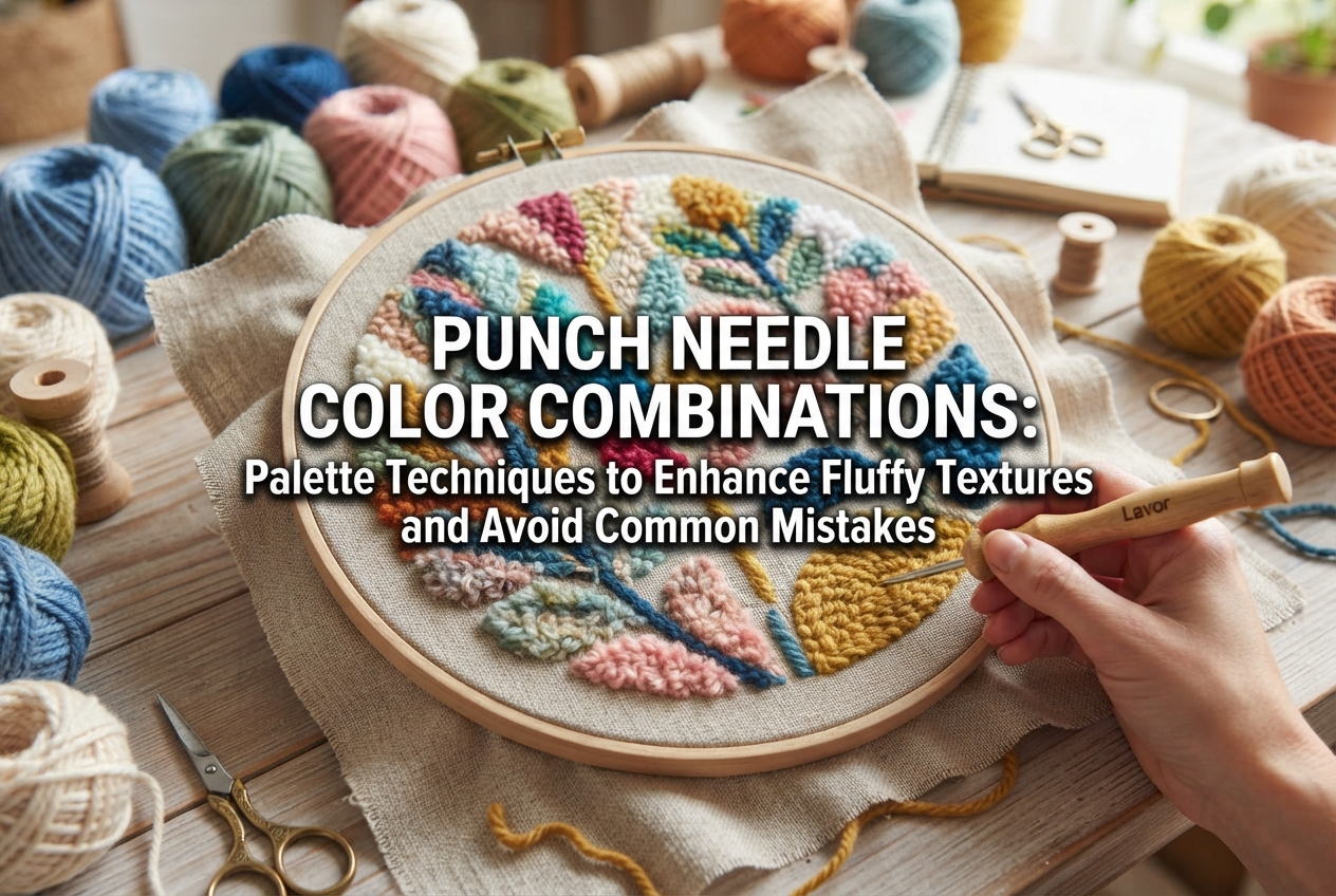
Punch needle is such a delightful craft. Working a special needle rhythmically through fabric to create neat little loops yields that irresistibly plush, three-dimensional texture that crafters everywhere love so much.
Yet, when working on a project, have you ever felt that your colors just didn’t seem to click? Perhaps the borders of your design blurred together, making it difficult to tell what you had punched, or maybe you combined all your favorite shades only to end up with a cluttered, disjointed piece.
In fact, punch needle has one major visual characteristic: the three-dimensional loops and the shadows cast by the pile actually change how colors appear to the eye. Because of this, selecting a color palette requires a slightly different approach than drawing a flat illustration or working standard surface embroidery.
In this guide, I will share plenty of color-matching techniques that beginners can easily apply to create sophisticated, well-balanced punch needle designs. From yarn selection to practical palette formulas, let’s explore the essentials together!
In punch needle, your choice and combination of colors fundamentally determine the finish of your work. Let’s look at why palette planning is even more crucial here than in flat illustrations or standard surface crafts.
The defining feature of punch needle is the surface of dense yarn loops formed as you work. When packed closely together, these loops give the finished piece real physical depth and texture.
Because of this dimensional quality, tiny shadows form between the loops whenever light hits the surface. Consequently, once yarn is punched into dense loops, it often looks slightly darker and more muted than it did sitting in an unworked skein or ball.
Color combinations that look striking in a flat drawing can easily become muddied or overly dark when translated into punch needle due to these shadows. Factoring in the yarn’s natural shadows is an essential step in choosing your shades.
Unlike standard embroidery, which often focuses on delicate line work, punch needle is primarily about filling solid areas with dense yarn.
Because colors spread across wide, uninterrupted blocks, their proportions and mutual compatibility immediately catch the viewer’s eye. Even slight clashes or poorly balanced shades become magnified as visual tension across the entire piece.
Beginners tend to fall into several predictable traps when picking yarn colors. Check these against your own past projects and habits to see if any sound familiar.
Walking into a craft store and browsing shelves stacked with colorful yarn is endlessly exciting. It is all too tempting to think, “This pink is gorgeous, and I have to use this yellow too!” and pack every favorite shade into one single pattern.
However, when you use too many colors, it becomes unclear which shade is meant to be the focal point. The viewer’s gaze wanders without a resting spot, resulting in a busy, disjointed composition.
Imagine designing a cute motif using soft pastels—say, pastel pink, baby blue, and pale yellow.
Even though their hues (red, blue, yellow) differ, if their brightness (value) is roughly the same, the borders between them will blur once punched in yarn. When viewed from a distance, the shape of your motif loses definition, making the design hard to decipher.
Another frequent frustration is finding that colors which looked harmonious in their skeins look entirely different once worked into the fabric.
Yarn that reflects light brightly on the ball changes tone as it is punched densely into loops, taking on subtle shadows. When you cannot anticipate this shift, you are often left wondering why the finished project feels so different from what you imagined.
How can you create the chic, tasteful palettes seen in professional craft studios and curated social media feeds? Here are practical rules anyone can implement right away.
Whenever you are unsure, restrict your yarn palette to just three or four colors per piece. Simply narrowing your selection dramatically increases the overall cohesion of your work.
When selecting your shades, assign them clear functional roles based on this golden ratio:
For example, if you are making a coaster, you might use ecru for the background base, mustard yellow for the main floral motif, and dark brown for the flower center or leaf accents. Sticking to this ratio gives your piece a polished, intentional look.
To ensure the contours of your motif stand out cleanly, clear contrast in brightness (value) between neighboring sections is essential.
Plan your layout so that lighter shades (such as white, ivory, or pale gray) sit directly alongside darker tones (like navy, deep brown, or forest green).
If you genuinely want to place soft shades side by side, consider separating them with a darker outline or introducing physical height variation in the loop length.
Even when working with different hues (such as red, blue, and yellow), keeping them within the same “tone” (a shared level of saturation and lightness) creates instant visual harmony.
Common tonal groups include:
For instance, if you choose a dusty rose, pair it with a muted sage green and a dusty mustard yellow from the same subdued family. Dropping a vivid, primary yellow into that muted mix would disrupt the atmosphere and feel out of place.
If you are not sure where to begin, here are four reliable color palettes that look particularly beautiful in punch needle’s textured loop finish.
A cozy, warm combination that blends seamlessly into everyday living spaces. Use warm beige or ivory for the base, mustard yellow for the main design, and quiet sage green for accents. It is an ideal match for botanical motifs and minimalist geometric shapes.
Great for a stylish, gently nostalgic aesthetic. Brick-like terracotta orange and deep navy complement each other wonderfully. Adding soft, natural ecru in between prevents the bold tones from clashing, yielding a playful yet refined finish.
A sophisticated palette that balances softness with modern elegance. Pink can sometimes read as overly sweet, but choosing an ashen dusty pink and grounding it with deep charcoal gray creates an urban, adult aesthetic. This works wonderfully for zip pouches and smaller accessories.
A grounded, nature-inspired palette. Rich browns and earthy khakis highlight the organic texture of the yarn. This palette is especially suited for autumn and winter coasters, mini rugs, or warm-toned room decor.
Because yarn looks different once punched, verifying your palette beforehand saves time and disappointment. Here are three simple preparation techniques I always use before starting a piece.
Instead of merely placing full skeins next to each other on a table, try cutting a 15 cm (6-inch) strand of each yarn you plan to use. Wrap each strand around your fingers a few times to create small, thick loops, and lay these bundles tightly side by side.
Bundling the yarn mimics the density and shadows of actual punch needle loops, giving you a much truer preview of how the shades will interact.
When you are not sure if neighboring colors have enough contrast, your smartphone camera offers a foolproof test.
Line up your yarn bundles, take a photo, and convert the image to black-and-white (grayscale) using your phone’s edit tool.
If two adjacent yarns look like nearly identical shades of gray in monochrome, they lack adequate value contrast. You immediately know that one needs to be replaced with a noticeably lighter or darker option. If the contrast remains distinct in black-and-white, your design will read crisply in the finished piece!
Especially for larger projects, I strongly recommend punching a tiny test swatch (about 2 cm × 2 cm, or roughly 1 inch square) on the margin of your backing cloth or on a scrap piece.
Punching real loops into fabric lets you verify loop density, check how the yarn interacts with the backing cloth, and confirm color blending with complete accuracy. Spending five minutes on a quick swatch protects you from hours of frustrating rework later.
Once you are comfortable with basic palettes, experiment with techniques unique to the dimensional world of punch needle.
When working with an adjustable thick needle or using fine-to-medium yarns, you can thread two different colored strands through your needle simultaneously.
Punching ivory and light gray together, for example, creates an intricate melange or heathered effect that a single solid yarn cannot replicate. It lets you produce one-of-a-kind custom shades that bring subtle depth to your design.
Many punch needles allow you to adjust loop height using length-adjustment rings or notches.
When using yarns of similar tones, punch the lighter color with longer loops and the darker color with shorter loops. The physical step-down casts a real shadow along the border, adding structural contrast and keeping monochromatic palettes from looking flat.
If you have your heart set on pairing delicate, low-contrast pastels, encircle the motif with a single row of a dark outline, such as deep gray, dark brown, or black.
Much like the leading in stained glass or ink outlines in an illustration, this dark frame clarifies the motif’s shape while allowing you to enjoy soft, gentle colors inside.
To give you an idea of how I plan my colors, here is my thought process when approaching different project formats.
When crafting pieces intended for display at home, I choose my base color to harmonize with the furniture or walls where the piece will live.
For a coaster resting on a wooden table, I might select an ecru or warm beige base that echoes the wood grain, drawing accent colors from existing room accents—like the green of houseplants or the yellow of a nearby ceramic vase. Tying the project to its surroundings ensures it blends naturally into the living space.
For wearable items like brooches on a bag or small everyday pouches, I take the opposite approach.
Because small accessories cover limited surface area, conservative palettes can easily get lost. Here, I embrace higher-contrast pairings and vibrant accent pops that might feel slightly daring on larger decor pieces. That playful punch of color is one of the greatest joys of handmade craft!
Choosing colors for punch needle is a blend of understanding the medium’s physical texture and applying simple design principles.
To recap the key points:
Sorting through yarn and selecting your palette is often the most exciting stage of punch needle. Take your time, test your yarns with small swatches, and enjoy watching your chosen colors come alive in plush, tactile loops!
If you found this guide helpful, please share it with your fellow crafters. Happy punching, and see you in the next post! — Yassy from Crafters
For example, if you are looking for articles about mizuhiki, try searching for "mizuhiki"; if you are interested in tools, try keywords like "nippers" or "pliers."