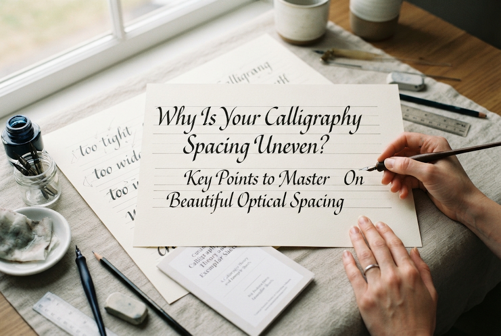
Why Is Your Calligraphy Spacing Uneven? Key Points to Master Beautiful Optical Spacing
yassy
Crafters!
Hello, everyone! It’s Yassy from Crafters! (・∀・)
Whether you have spotted graceful hand-lettered scripts on wedding welcome boards, artisanal greeting cards, or bespoke stationery, there is an undeniable magic to calligraphy that makes many makers think, "I would love to write like that!"
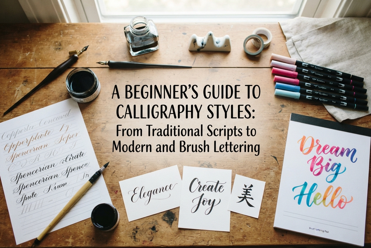
Yet, the moment you begin researching how to get started, you are immediately confronted with a dizzying array of terms: Italic, Copperplate, Modern Calligraphy, and more. It is completely natural to wonder: "What are the actual differences between these styles?" and "Which one should a beginner tackle first?"
The term "calligraphy" encompasses a vast world—ranging from centuries-old, highly disciplined Western historical hands to expressive contemporary styles and approachable brush lettering. The tools, nib geometries, and writing techniques vary significantly across each discipline.
In this guide, I will break down the primary categories of calligraphy, explore five representative historical hands, outline tool differences, and share practical advice to help you choose the best style for your creative journey without getting overwhelmed. By the end of this article, you will have a clear vision of where to begin!
The word "calligraphy" originates from the Greek words kallos (beauty) and graphein (to write). While it broadly refers to the art of beautiful writing, modern handmade and design practices typically classify calligraphy into three main styles. Identifying which aesthetic speaks to you is your first step forward.
Rooted in medieval European illuminated manuscripts and formal historic documents, this category comprises hands governed by established historical tradition. Pen angle, letter height (x-height), slant, and stroke sequences are defined by strict proportions and rules.
Classical calligraphy carries a structured, timeless elegance. It is widely used for formal certificates, traditional card making, and bookbinding design. If you enjoy precision, order, and historical craftsmanship, this is an incredibly rewarding discipline.
Modern calligraphy builds upon the foundational mechanics of traditional pointed-pen scripts while discarding rigid rules in favor of artistic freedom. Defining characteristics include varied letter sizes, playful flourishing, and "bouncing" baselines where letters dance rhythmically above and below the line.
Chic, organic, and relaxed, modern calligraphy has become a favorite for DIY wedding stationery, gift tags, and social media imagery. Its greatest appeal lies in celebrating your personal handwriting style and creative intuition.
Rather than using metal dip nibs and bottled ink, brush calligraphy employs brush pens (such as felt or nylon-tipped markers) or watercolor brushes. By using the elastic rebound of the tip, you produce heavy downstrokes under pressure and whisper-thin upstrokes with a light touch.
Because it requires neither messy bottle setups nor extensive nib care, brush lettering can be practiced anywhere with just a pen and paper. It is wonderful for casual stationery, bullet journaling, and hand-drawn signage.
Western historical calligraphy boasts countless scripts, but five enduring hands stand out for their beauty, historical significance, and modern relevance. Learning their profiles will help you envision how to incorporate them into your craft projects.
Widely regarded as the premier foundational hand for beginners, Italic developed during the 15th-century Italian Renaissance. It features a gentle forward slant and an exceptionally legible, graceful cadence.
Written with a flat-edged broad nib held at a consistent 45-degree angle to the baseline, Italic combines fluid movement with practical utility. It remains a versatile powerhouse for birthday cards, certificates of appreciation, and formal place cards.
Flourishing in medieval Europe from the 12th through the 15th centuries across religious texts and manuscripts, Gothic is dense, dramatic, and historic. Because the heavy vertical strokes create a dark, textured page, it is frequently referred to as "Blackletter."
Defined by sharp angles, rigid verticality, and striking presence, Gothic adds a bold, antique atmosphere. It is a fantastic choice for theatrical event cards, Halloween decor, and vintage-style craft projects.
Developed in 17th- and 18th-century England and popularized via copperplate engravings, this script is celebrated for its sweeping, looped ascenders and fluid lines. The striking contrast between hairline upstrokes and shaded downstrokes forms its hallmark aesthetic.
Unlike broad-edged hands, Copperplate is written with a sharp, flexible pointed nib. Line thickness is controlled entirely by varied hand pressure. Mastering this pressure gradient takes deliberate practice, but the resulting elegance represents the pinnacle of formal wedding invitations and high-end paper goods.
A hand dating back to early medieval Europe between the 4th and 8th centuries, Uncial is recognizable by its broad, rounded letterforms. Because it developed before the formalized distinction between uppercase and lowercase emerged, it exists primarily as a singular, majuscule-like script.
With its soft, historic curves and storybook aesthetic, Uncial brings an inviting, legendary charm to fantasy-themed crafts, children's storybooks, and festive Christmas paper goods. Because its pen angle requirements are relatively straightforward, beginners can grasp its silhouettes quite readily.
Commissioned in the late 8th century under Emperor Charlemagne of the Frankish Empire, this script was developed to standardize manuscript copying into a clear, legible, and uniform hand across Europe.
Rooted in circular geometry with balanced negative space, Carolingian served as the direct evolutionary ancestor of our modern lowercase alphabet. Its clean, understated simplicity makes it a gorgeous choice for understated, botanical, or rustic paper crafting.
While historic scripts offer profound technical beauty, modern calligraphy has taken the global handmade and DIY community by storm. Here is why so many makers are drawn to it:
Where traditional calligraphy asks "How precisely can I reproduce this historic archetype?", modern calligraphy asks "How can I make this composition feel stylish, warm, and distinctly mine?" For crafters seeking to integrate custom lettering into lifestyle projects, this low-pressure, expressive approach is wonderfully welcoming.
The nib geometry you select fundamentally dictates your hand movement and the line character you achieve. Categorizing calligraphy by tool helps ensure you buy the right supplies from the start.
These metal nibs feature a flat, straight-cut edge, reminiscent of a cut bamboo reed. Mounted into a straight pen holder, they are dipped into ink before writing.
Their defining mechanism: stroke contrast occurs naturally without changing hand pressure. By keeping the nib edge fixed at a specific angle (such as 45 degrees) and moving the pen across the page, thin edges and broad strokes emerge automatically. This tool is used for Italic, Gothic, Uncial, and Carolingian scripts.
These metal nibs taper to a sharp, needle-like tip and are used for Copperplate and pointed-pen modern calligraphy.
A slit runs down the center of the nib. When you apply gentle downward pressure, the two tines split open, allowing a generous flow of ink onto the paper to produce a swell. Releasing pressure brings the tines back together for a delicate hairline. Contrast is governed entirely by manual pressure control.
Featuring tips made of flexible nylon bristles or elastomeric synthetic felt, brush pens provide an all-in-one alternative to dip pens.
Much like pointed nibs, brush pens create dynamic line variation through applied pressure. However, because ink is stored in an internal reservoir, you bypass dipping and ink-well management. They are portable, quick to set up, and ideal for card making, planner decor, and practice sessions on the go.
Calligraphy has a gentle learning curve once set up properly, but early misconceptions can lead to unnecessary frustration. Keep these three traps in mind:
Mesmerized by viral videos of flexing pointed nibs, many beginners jump immediately into Copperplate or pointed-pen modern calligraphy. In practice, controlling tines requires nuanced micro-adjustments.
If you press down while pushing upward or catch an edge on the paper, the nib can snag, fling ink, or shred paper fibers. Knowing that pointed-pen control requires dedicated patience prevents you from feeling discouraged if your first strokes feel shaky.
It is tempting to think an everyday fountain pen will do the trick, but everyday writing pens are engineered to deliver a consistent, uniform line in every direction.
To achieve calligraphy's characteristic contrast, you must use designated tools: broad dip nibs, flexible pointed dip nibs, specialized calligraphy fountain pens with crisp broad nibs, or flexible brush markers. Investing in the proper tool makes an immediate, visible difference.
Writing on plain white printer paper without guide markings is one of the most common beginner missteps. Even seasoned master calligraphers rely on faint pencil guidelines or guide sheets placed beneath translucent practice paper to regulate x-height, ascender/descender ratios, and slant angles.
Without guidelines, letters drift, scale fluctuates, and slants wander. Always use a ruled guideline sheet during practice to train your muscle memory accurately.
If you are still wondering where to begin your journey, here is how I suggest choosing based on your creative goals:
If your goal is to understand fundamental stroke architecture, pen angles, and disciplined posture, I unequivocally recommend starting with Italic using a broad nib.
Because line variation happens automatically via the 45-degree angle rather than muscle tension, you do not need to fight pressure control. Instead, you can channel all your attention into letterforms, spacing, and rhythm. The awareness of stroke geometry you build through Italic will serve as an invaluable foundation for any style you explore later.
If your main desire is making cute cards right away, addressing wedding envelopes, or adding hand-lettered charms to gifts, start with brush calligraphy—specifically using small, firm-tipped brush pens.
Small brush pens let you develop a feel for thick downstrokes and thin upstrokes without the finicky snagging or ink splatters of metal pointed nibs. Once your hand grows comfortable with the rhythm of applying and releasing pressure on a brush pen, transitioning to a flexible pointed metal nib for modern calligraphy becomes dramatically smoother.
Once you settle on a direction, here are the core supplies to assemble:
A Quick Preparation Tip: Brand-new metal nibs come coated in a thin layer of manufacturer oil to prevent rust. Before dipping a new nib into ink, gently clean it with a little mild dish soap and water (or wipe it down) to remove this film. If you skip this, ink will bead up and roll off the nib instead of flowing smoothly onto the page!
From the disciplined, historical grandeur of European scripts to the playful, expressive rhythms of modern brush lettering, calligraphy offers a creative avenue for every type of maker. There is no single "superior" style; the best one is simply the one that aligns with the projects you dream of making.
Take that exciting first step—whether with an affordable brush pen or an Italic starter nib. Taking a quiet moment to sit down, dip a pen in ink, and shape thoughtful letters on paper brings a calming, meditative focus that enriches any creative lifestyle.
I hope you find a style that sparks your imagination and step confidently into the joyful world of hand lettering!
If you found this guide helpful, sharing it with your fellow makers on social media or in your craft circles means the world to me!
Until next time, happy crafting—this was Yassy from Crafters! (・∀・)


For example, if you are looking for articles about mizuhiki, try searching for "mizuhiki"; if you are interested in tools, try keywords like "nippers" or "pliers."