A Beginner’s Guide to Calligraphy Styles: From Traditional Scripts to Modern and Brush Lettering
yassy
Crafters!

Hello, this is Yassy from Crafters! (・∀・)
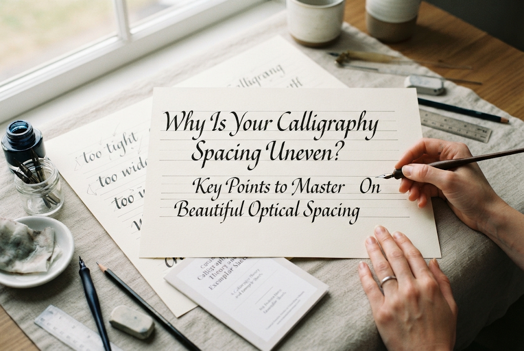
Have you ever practiced calligraphy repeatedly, mastered the shapes of individual letters, only to find that everything looks awkward the moment you arrange them into words or sentences? When looking at a line of text, some gaps between letters appear strangely wide, while others look cramped and squeezed, ruining the overall rhythm of the piece. This is a very common issue among calligraphers.
This "uneven letter spacing" is a major hurdle that almost every calligraphy beginner stumbles upon. Even if each letter is beautifully drawn, inconsistent spacing significantly lowers the finished quality of your work.
In fact, behind this uneven spacing lie clear causes related to optical illusions, misconceptions about letter structures, and pen control. Today, I will break down the fundamental reasons why spacing breaks down and share detailed points to help you master beautiful optical spacing!
The most common trap beginners fall into when starting calligraphy practice is attempting to measure the distance between letters equally in millimeters. Precise crafters often try to use a ruler to leave an exact, uniform gap between every single letter. However, this exact approach is actually the biggest culprit behind uneven-looking spacing.
Alphabet letters do not all fit into identical rectangular boxes. Letter shapes are incredibly varied: some consist of vertical straight lines like "l" or "i", others feature rounded curves like "o" or "c", some have diagonal strokes like "v" or "w", and others have extending parts like "r" or "t".
Suppose you mechanically decide to place every letter exactly 3 mm apart from edge to edge. When straight lines face each other (such as in "ll" or "in"), they are framed by vertical walls on both sides, making the gap look extremely tight, dark, and crowded.
On the other hand, where curved lines face each other (such as in "oo"), large open spaces are created at the top and bottom. Even with the same 3 mm physical distance, the gap appears loose and empty. When you fix the physical distance to a constant measurement, the actual visual gap varies drastically depending on letter shapes, making the overall line look inconsistent.
The essence of spacing in calligraphy is not making distances physically equal, but rather ensuring that the area of white space trapped between letters—the "optical space"—feels uniform throughout.
Imagine invisible water or air being poured into the gaps between letters. The absolute rule of beautiful spacing is to arrange your letters so that the volume of "air" trapped between each pair remains constant across the entire word.
This requires visual adjustments (optical spacing): pulling letters closer together when their tops and bottoms open wide and hold a lot of air, and pushing letters slightly further apart when their forms close off space and keep air trapped. Attempting to write based solely on physical measurement without understanding this concept is the root reason why letter spacing fails to settle.
Even when you understand the importance of optical space, your spacing can easily break down when it comes to actual execution. Let's examine seven specific causes hidden within hand movement, line of vision, and how you perceive letterforms.
If you write without keeping in mind how adjacent letter shapes interact, your spacing will inevitably fall out of balance. The combinations of adjacent strokes generally fall into three main patterns:
Furthermore, letters with wide tops like "T" or "Y", letters with wide bases like "A", or letters with protruding right arms like "r" contain large amounts of negative space within their own structures. Without a conscious effort to adjust distances for each specific combination, some spots will look on the verge of colliding while others will form unnatural, gaping holes in your text.
In slanted hands like Italic or Copperplate, the most frequent issue is inconsistent slant. When the angle of inclination varies between letters, spacing automatically collapses.
For example, if your first letter leans gracefully at 55 degrees, but the next letter stands up nearly straight at 65 degrees, the tops of the letters will drift apart while their bases come unnaturally close. Conversely, if a trailing letter leans too far forward, the tops will collide. Only when the parallel slant lines of all letters are aligned can the gaps between them form a clean, uniform band of space. When spacing feels uneven, check whether the slant of all letters is aligned before blaming the negative space itself.
In calligraphy, every script has reference letters that define the overall rhythm of words. For most lowercase scripts, these key reference letters are "n" and "o".
The width of the inner space (counter) of the arch in "n" sets the basic unit of space for that script. The same applies to the width of the oval in "o". If the width of these foundational letters changes every time you write them—sometimes wide, sometimes narrow—maintaining consistent spacing between letters becomes impossible. The internal space of a letter (intraletter space) and the space between letters (interletter space) must interlock in a visually pleasing ratio. If your letter proportions are unstable, your letter spacing will naturally fluctuate every time.
In script styles that connect letters continuously (such as Copperplate or Modern Calligraphy), letter spacing is determined almost entirely by the exit stroke—the connecting line moving from the end of one letter toward the next.
If the upward angle of the exit stroke rises too steeply after finishing a letter, the distance to the next letter becomes too short and cramped. Conversely, if you flatten the stroke and stretch it out too long, the space between letters opens up unnaturally. If the angle, curve depth, and target height of your exit strokes vary from letter to letter, the overall spacing of the word will be completely disrupted, regardless of how well individual letters are drawn.
For scripts using a broad nib (a flat nib similar to a flat brush, used for Italic or Foundational Hand), you must maintain a consistent nib angle (e.g., 40 or 45 degrees) relative to the paper. If the nib angle shifts midway through writing, strokes that should be thin become thick, or thick strokes become thin. Changing stroke thickness means the letter outlines expand outward or shrink inward, altering the surrounding space.
Similarly, when using a pointed nib, erratic pressure control can cause strokes to swell unexpectedly, physically compressing the space between letters. If stroke thickness fails to maintain a steady rhythm, the area of negative space will fluctuate randomly as well.
Where are your eyes focused while you write? Many beginners stare intently at the ink flow coming from the nib or the line they are actively drawing. However, to adjust spacing properly, you must look not at the stroke itself, but at the shape of the white space forming to the left of the stroke you are currently drawing.
You cannot create appropriate negative space unless you keep in mind the white space framed between the right side of the previous letter and the left side of the letter you are about to draw. Staring strictly at your stroke means you only realize you are too close or too far from the previous letter after you finish writing it. Failing to monitor the shape of negative space as you write is a major reason for spacing errors.
Your body posture and movement mechanics also play a role. Are you anchoring your wrist or palm firmly onto the desk and writing using only finger movements and wrist snaps?
If you write while keeping your hand fixed and progress to the right, you might manage a natural angle for the first letter or two, but by the third letter, your wrist will bend outward awkwardly. This distorts your pen angle and pressure distribution. As a result, spacing tends to widen or crowd as you move rightward, breaking stroke consistency. In calligraphy, you need to slide your entire forearm across the desk, maintaining a constant alignment between your wrist and pen as you move sideways. Without smooth arm movement, letter spacing becomes uneven to compensate for the physical limits of your hand's reach.
So, what specific distances should you aim for to keep visual negative space equalized? Memorizing basic combination rules based on letter shapes helps establish consistent spacing without relying entirely on guesswork.
This is the case where two vertical straight strokes face each other. In this arrangement, there is no place for space to escape at the top or bottom, making the negative space feel very dense and tight. Therefore, the absolute rule when placing straight lines side by side is to give them the widest physical distance among all combinations. Secure a clear gap equal to or slightly narrower than the internal counter width of your reference letter "n". Squeezing this gap causes the strokes to look like a solid black fence, severely ruining readability.
In this setup, the outer curve of a rounded letter faces a straight vertical wall. The middle, most outward point of the curve approaches the straight stroke, but triangular white spaces naturally open up toward the top and bottom corners. Because air escapes at the top and bottom, the correct approach is to bring them slightly closer together than a straight-to-straight pairing. Leaving the same distance as between two straight lines will cause the letters to look isolated from each other due to the wide open spaces above and below.
Here, both letters curve outward toward each other. Only a tiny area near the central contact points comes close, creating large white spaces at the top and bottom. Thus, among the three basic patterns, this combination requires writing them closest together physically. Only when you pull the outermost central curves so close that they almost touch will the total area—including the top and bottom openings—feel equal in weight to the gaps between other letters.
The trickiest letterforms to place are those with special shapes that harbor large open spaces on their right or lower sides. For example, "r" has a hollow cavity beneath its right-hand arch. If you measure a standard distance from the right tip of the "r" to place the next letter, that gap combines with the cavity underneath to form a massive blank void. Therefore, the letter following an "r" should be tucked slightly under the arch, positioned considerably closer than usual.
The same applies to letters with diagonal strokes like "v" or "w". You need the flexibility to account for the negative space created along their diagonal slopes and adjust the distance dynamically based on the shape of the adjacent letter.
Even when you understand the theory, there are subconscious mistakes that happen during actual practice. Check if you have fallen into any of these habits:
If you view letters as rigid bounding boxes, your spacing will never settle. Positioning letters at fixed physical intervals from the outermost edge of one letter to the outermost edge of the next leaves hollow gaps around rounded letters, as discussed earlier. Rather than viewing letters as wide, three-dimensional objects, adopt a subtractive perspective: ask yourself how writing those letters cuts out and shapes the white paper in the background.
A calligrapher's mindset manifests directly in their spacing. When approaching difficult letters like "s" or "a", writers often subconsciously hesitate out of fear of colliding with the preceding letter, leading them to leave a wide gap before it. Furthermore, right after carefully completing a challenging letter, feelings of relief or momentary hesitation about placing the next stroke can cause the trailing space to stretch out unnaturally as well. If spacing consistently stretches around specific letters, the cause is often a psychological brake rather than purely technical difficulty.
Here are effective practice methods to resolve uneven spacing and write refined, beautifully balanced lines of text.
In addition to horizontal baselines and x-height lines, draw closely spaced diagonal slant lines on your practice sheets. As a guideline, fill the page with fine slant lines spaced at intervals of 1 to 2 letter widths. Keeping these slant lines in mind as a visual striped wall forces all your letter angles into alignment. Aligning the slant alone dramatically resolves more than half of your negative space inconsistencies.
Instead of jumping straight into long words, start by practicing continuous strings of basic reference letters. I recommend repeatedly writing the following combinations:
When writing these three patterns, aim for a state where the thickness of the black ink strokes and the width of the white paper gaps alternate in a harmonious rhythm. Without sinking this foundational sense of space into your fingertips and eyes, controlling spacing in complex words will remain out of reach.
After finishing a practice piece, do not immediately inspect the letter details up close. Prop your paper up against a wall or hold it out at arm's length, squint your eyes, and look at the whole piece softly. Squinting blurs the individual letter outlines, turning the line of text into a gradient band of black and gray tones.
If a spot looks noticeably darker or heavier than its surroundings, the spacing there is too tight. Conversely, if a spot looks bright like a white hole, the spacing is too wide. A line of text that appears as a soft gray band of uniform density across its entire length is proof of perfect optical spacing. Taking a photo with your smartphone from a distance and converting it to black and white is another great, objective way to evaluate your work.
If I were to advise someone struggling with uneven spacing, I would suggest a paper-cutting experiment using tracing paper. Cut out your written letters individually with scissors, place them on a fresh sheet with a drawn baseline, and use your fingers to slide the letters left and right, solving the spatial puzzle to find their ideal positions.
When holding a pen over paper, your brain's capacity is fully occupied with the pressure of drawing clean lines and controlling ink flow, leaving little mental bandwidth to observe negative space. However, when you are simply sliding paper letters around, 100% of your focus goes directly to the white area between them.
Experiencing firsthand realizations like "Ah, straight lines look so cramped unless I separate them this much!" or "Curved lines look natural even when brought this close together!" creates a clear visual goal in your mind for the next time you pick up your pen.
Uneven calligraphy spacing is not caused solely by a lack of technical skill. The root causes lie in visual perception—such as measuring letters with physical ruler distances or focusing entirely on inked strokes while overlooking the white background space.
Letterforms consist not just of black ink lines, but of the white negative space carved out by those lines. By cultivating an awareness of balancing the volume of air trapped between your letters, your written words will look remarkably refined and flow with a delightful rhythm.
Start by setting up precise guidelines and carefully observing the negative space of your foundational letters. Refine your spatial sense step by step, and aim to create beautifully balanced calligraphy art! (・∀・)
If you found this helpful, sharing this article on social media or with your crafting friends would mean the world to me and keep me inspired!
Until next time, happy crafting! This was Yassy from Crafters!







For example, if you are looking for articles about mizuhiki, try searching for "mizuhiki"; if you are interested in tools, try keywords like "nippers" or "pliers."