10 Photography Mistakes to Avoid for Handmade Items: The Rules That Boost Sales
yassy
Crafters!

Hello, craft lovers! This is Yassy from Crafters! (・∀・)
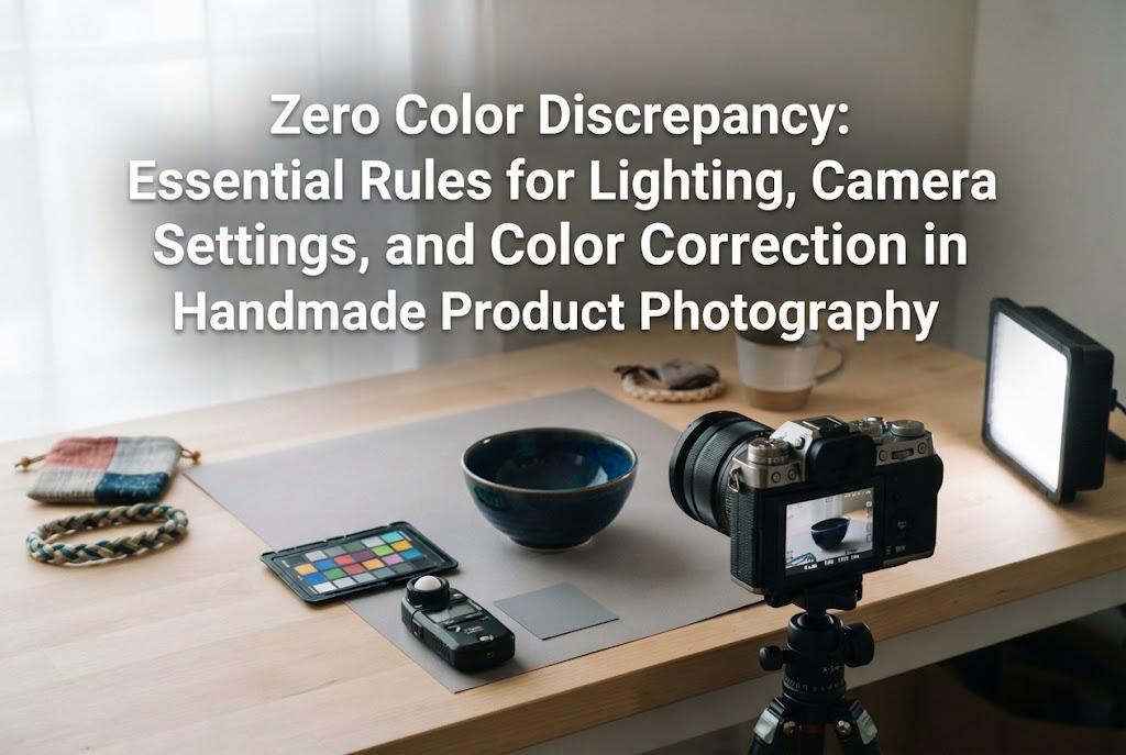
Have you ever taken photos of your handmade creations only to sigh in frustration: "Why does this look so different from the real piece?" Even when you have total confidence in your craft, your camera might produce an image that looks unpleasantly cold and blue, or murky and yellow. This color discrepancy is one of the most frustrating hurdles every maker faces.
As someone who loves making, viewing, and collecting handmade pieces, I know firsthand just how crucial accurate color reproduction really is. When browsing online shops as a buyer, it is deeply disappointing to open a package and find an item whose colors look nothing like the listing photos, no matter how beautifully it was made. And as a seller, having a customer reach out to say, "The color looks completely different in person," is the absolute last thing you want to hear.
Capturing accurate color in photography is not an innate artistic sense—it is strictly a matter of knowledge and technique. Once you understand the physical and technical reasons colors shift, set up the proper lighting environment, and adjust a few simple settings, anyone can reliably reproduce true-to-life colors.
In this comprehensive guide, I will share the exact rules and techniques to eliminate color shifts once and for all, ensuring your photos convey 100% of your work's genuine beauty.
When photographing handmade items for sale, delivering accurate color is far more critical than simply making photos look "pretty" or "stylish." Ignoring this distinction can trigger serious problems that undermine your entire creative business.
Across handmade marketplaces and e-commerce platforms, the leading reason for customer dissatisfaction and disputes is: "The color was not what I expected." Customers rely solely on your photos when clicking the purchase button. If their first reaction upon opening the box is "This isn't what I ordered," their excitement instantly turns into a feeling of betrayal.
No matter how carefully you package your item or how flawless your craftsmanship is, a mismatched color often leads straight to negative reviews and return requests. A single complaint over color discrepancies can instantly erode the trust you worked so hard to build.
Eye-catching photos designed to go viral on social media often use dramatic shadows, moody lighting, and trendy filters to build an artistic atmosphere. However, listing photos intended for commerce are catalog photos—their primary job is to explain and depict the product accurately.
Heavy filters that alter true colors or overly emotional mood lighting are counterproductive in product listings. What your buyers need is ruthless accuracy—photos that match the physical object even when placed side by side. Once you achieve faithful color, you can then add tasteful styling to enhance its appeal, never the other way around.
Makers who maintain a loyal base of repeat customers over the long term share one common trait: they never compromise on color fidelity. The reassurance that "this shop always delivers items that look exactly like their photos" is what builds an enduring brand. Capturing true-to-life color is the highest form of sincerity you can offer your buyers, and it serves as your strongest asset for safeguarding your reputation.
When the color in your photo does not match the object in front of you, there is always a clear, scientific reason. Rather than blaming your camera or smartphone, let's understand the three fundamental culprits behind color shifts.
The light in our everyday living spaces comes in various "colors." Sunlight, fluorescent tubes, and warm incandescent bulbs each possess an inherent color temperature, measured in Kelvin (K). Natural sunlight shifts throughout the day, tungsten bulbs cast an orange glow, and standard office-style fluorescents give off a cool, bluish-white hue.
The most dangerous scenario for product photography is "mixed lighting"—such as leaving the ceiling light on while letting natural window light into the room. When warm orange light and cool daylight strike your work simultaneously, your camera's sensor cannot decide on a single baseline, resulting in blotchy, unnatural, and distorted colors across your item.
Modern smartphones feature advanced automated image processing. One feature that is constantly active is Auto White Balance (AWB). While convenient for everyday snapshots, AWB is often the worst enemy of handmade product photography.
For instance, when you frame a green fabric piece, the camera might think, "There is far too much green here; let me balance it by adding magenta." As a result, the lush green of your item gets turned into a muddy, dull tone. The camera's automated "correction" ends up ruining the authentic color.
The surface on which you place your craft directly affects how your camera evaluates the scene. If you position an item on a pure black backdrop, the camera assumes the entire scene is too dark and artificially boosts the exposure, making your piece look washed out. Conversely, placing an item against a bright, pure white backdrop often tricks the sensor into dimming the shot, rendering your piece dark and dingy gray.
If you don't account for how background tones influence the camera's meter, you will find yourself trapped in a cycle where colors look completely different in every shot.
Controlling your shooting environment is the most important step in eliminating color shifts. Before touching any camera settings, you must optimize your lighting.
Diffused natural light is the finest, most reliable light source for showing off handmade work faithfully. However, not all sunlight is equal. Avoid direct sunlight at all costs; direct rays produce harsh shadows and blown-out highlights that wash away delicate color tones.
Follow these conditions for optimal daylight photography:
Avoid late afternoon sunlight. The warm, reddish-orange tint of evening light alters colors drastically, making it unsuitable for accurate product representation.
Before snapping your first picture, perform this critical step: turn off your ceiling lights. Many beginners make the mistake of leaving the room's fixtures on while shooting near a window.
The moment overhead ambient light blends with natural daylight, the likelihood of capturing accurate color drops to zero. Stick strictly to a single light source—either 100% natural daylight from your window, or dedicated continuous studio lighting in a dark room.
If work or family schedules prevent you from shooting during midday daylight hours, invest in dedicated photography LED lights. When buying, the one specification you must never compromise on is the Color Rendering Index (CRI, often designated as Ra).
CRI indicates how faithfully a light source reproduces colors compared to natural sunlight. Typical household LED bulbs offer an Ra around 80, which causes red, pink, and green tones to look muted and dull. Always select photo lights rated at Ra 95 or higher. High-CRI lighting lets you achieve clean, vibrant, and accurate colors even in a dark room at midnight.
Be aware of "color cast," where surrounding colors reflect onto your piece. If your room has yellow wallpaper, if you are wearing a bright red sweater, or if there is dark wooden furniture nearby, those hues can bounce onto your product.
To block these unwanted reflections, surround your shooting area with clean white boards (simple white foam core or polystyrene poster boards from a dollar store work wonderfully). Standing white boards on the sides and front of your setup shields your piece from ambient color spill while gently bouncing neutral, soft white fill light back into the shadows.
With your environment prepared, turn to your smartphone settings and a few professional color-matching tools. You do not need complex gear; simple, methodical adjustments yield dramatic improvements.
Because native smartphone camera apps constantly shift white balance on the fly, consider using a third-party camera app that supports manual controls (such as Manual, ProCam, or Lightroom's built-in camera). These apps allow you to lock your White Balance (WB) to a specific Kelvin value.
When shooting under midday natural light, set and lock your white balance preset to "Daylight" (approximately 5200K to 5500K). Locking this number prevents your phone from shifting hues between shots.
Make full use of the AE/AF Lock feature by tapping and holding on your item on your smartphone screen until the lock indicator appears.
When exposure (brightness) changes, human eyes perceive color differently. If an image is overexposed, colors look faint and washed out; if underexposed, colors appear unnaturally deep and murky. Lock the exposure, then slide the brightness slider up or down manually until the depth of color matches the physical item before you hit the shutter.
If you want flawless color precision, pick up an 18% neutral gray card. These inexpensive cards provide an absolute reference point for color correction software.
Here is how simple it is to use:
Later, inside your editing app, select the White Balance Eyedropper tool and tap the gray card in your calibration shot. The software will instantly calculate the neutral value, correcting any lingering color cast. You can then copy and paste those exact white balance settings onto your clean product photos for guaranteed accuracy.
Your smartphone display itself can mislead you. Features like Apple's True Tone (which adjusts screen colors to match room lighting) or Night Shift / Blue Light Filters (which shift the display to an amber tone) distort what you are seeing.
Before evaluating or editing photos, turn off True Tone and Night Shift in your display settings, and set your screen brightness to a steady, medium level (around 50% to 70%).
Certain craft materials and pigments challenge digital sensors more than others. Here are targeted strategies for photographing notoriously difficult colors.
Vibrant reds, magentas, and deep pinks frequently cause clipping on digital sensors. Because camera sensors are extremely sensitive to red wavelengths, fine textural details can easily blur into a flat, oversaturated blob.
Solution: Slightly lower your camera's exposure slider when framing red items. Capturing the shot just a touch darker protects the highlights, retains delicate surface textures, and preserves subtle tonal gradients without clipping.
Camera sensors frequently struggle to differentiate red and blue spectrums in purples, indigo, and midnight blues, often rendering a rich violet as a plain, dull navy blue.
Solution: Never photograph purples under fluorescent bulbs, which lack continuous spectrum lighting. Shoot exclusively in stable, midday natural daylight or with high-CRI lights, keeping your white balance locked at 5500K to give your camera the full optical spectrum needed to register violet hues.
Lace tatting, embroidery, and neutral linen goods tend to blend into white backdrops, prompting the camera's meter to darken the entire shot into an unappealing gray.
Solution: Avoid shooting pure white items on stark, brilliant white backgrounds. Instead, place them on a subtle pale gray board or a natural light wood surface. This slight contrast prevents the exposure meter from dimming the image, keeping your white and cream tones crisp, clean, and bright.
UV resin creations, stained glass, sea glass, and translucent beads can look flat and dark if illuminated solely from the front or above, hiding the pigments inside.
Solution: Illuminate transparent materials from a 45-degree angle behind the piece (backlighting or semi-backlighting). Passing light directly through the material illuminates internal dyes, inclusions, and glitters. Place a clean white base underneath to bounce transmitted light back up into the piece.
Polished cabochons, glazed ceramics, metallic charms, and varnished polymer clay often suffer from harsh white specular glare that wipes out the underlying colors.
Solution: Never expose glossy surfaces to harsh, direct point lights. Place tracing paper, a dedicated photo diffusion scrim, or a clean white sheet between your light source and the item. Spreading the light across a wide, soft surface eliminates harsh hotspots while showing off a refined, smooth luster alongside the item's true color.
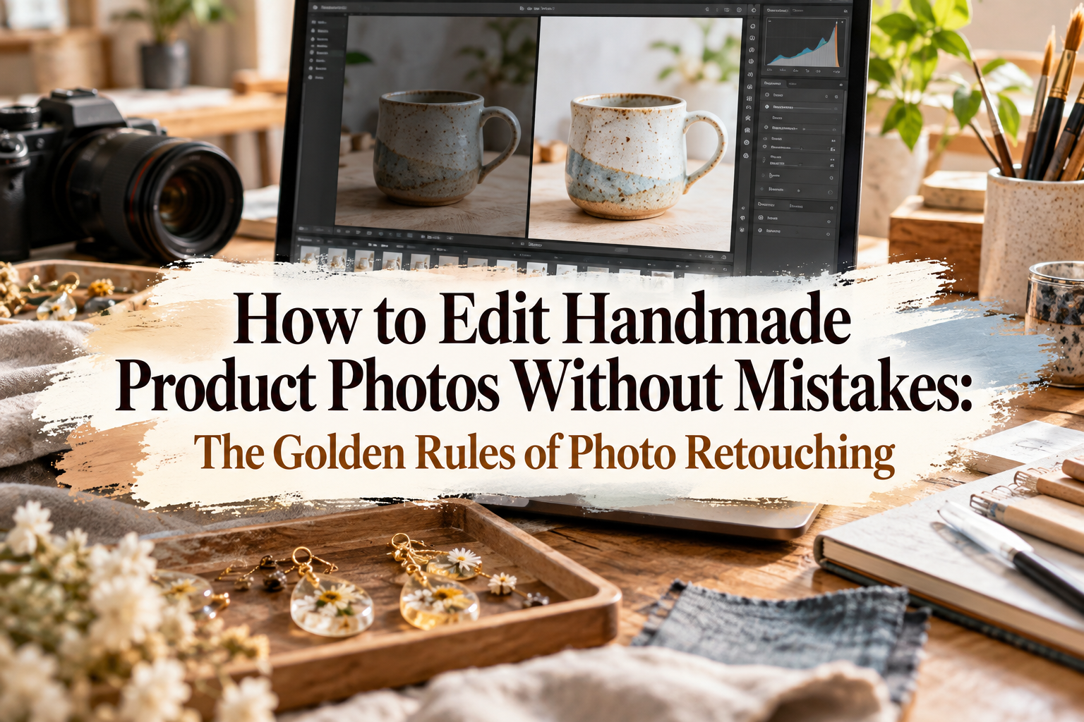
Some makers worry that photo editing is "cheating" or makes images look fake. In reality, thoughtful retouching is an essential step in professional photography to correct the gaps where digital sensors fail to capture what our eyes naturally perceive.
Using a free editing tool such as Adobe Lightroom Mobile, follow these steps to bring your photo in line with reality:
Before moving any sliders, set the actual physical creation on your desk right next to your phone or computer monitor. Never edit from memory; your mind naturally remembers colors as brighter and more vivid than they actually are. Compare your screen directly to the real piece under steady ambient light.
Your first adjustment should always be the Temperature slider:
Adjust until neutral areas—such as your white background or neutral props—look completely neutral and free of unwanted tints.
Next, adjust the Tint slider, a step many beginners overlook. Indoor lighting can leave a faint green wash, while certain window glass coatings can introduce an unwanted purple cast.
Neutralizing this axis clears away murkiness, allowing your true materials to shine clearly.
Once color balance is neutral, match the overall luminance. Raise or lower Exposure until the overall brightness matches how the item looks to your eye.
If shadows look crushed or bright highlights are blowing out fine textures, pull the Highlights slider down slightly and lift the Shadows. This restores textural depth to stitches, bead facets, and clay contours.
Resist the urge to push the overall Saturation slider up. While heavily saturated photos look punchy at a glance, they quickly detach from reality. Toggle between your unedited and edited photo, comparing the screen against the physical piece right beside you. When the screen and the real item appear virtually identical, your edit is complete.
Even with immaculate lighting and careful editing, one final hurdle remains: the variability of your customer's screen. Whether a buyer browses your shop on an older Android phone, a calibrated iPad, or an iPhone with brightness turned all the way down, slight visual variances will occur. Here is how to handle that gap with professional communication.
A blunt, dismissive disclaimer like "*Colors may vary from the photo" does little to build confidence or protect against disputes. Instead, demonstrate care and precision with a clear, polite explanation:
A Note Regarding Colors:All pieces are photographed in soft natural daylight and carefully color-corrected to reflect their true hues as faithfully as possible. However, please note that slight color variations may occur depending on your monitor settings, screen brightness, and the display characteristics of your device. Thank you for your understanding.
Explaining your intentional process assures buyers of your conscientiousness while setting fair, realistic expectations.
Supplement what the camera cannot fully convey by describing subtle hues in your written product description. Replace vague color terms with vivid, relatable descriptions:
Referencing familiar botanical, culinary, or natural elements helps buyers visualize the piece accurately in their hands.
For subtle or complex colorways, place a widely recognized reference item in one of your secondary listing photos—such as an unbleached linen cloth, white lace paper, or a clean white ruler. Furthermore, if your item comes in multiple colorways, show all variations lined up together in a single photo. Seeing hues relative to one another helps customers accurately perceive tonal depths.
Taking control of color in your handmade photography requires an intentional approach: from eliminating mixed light sources and locking phone settings, to using gray cards, performing side-by-side editing, and writing descriptive listing copy.
Let's recap the five golden rules of color fidelity:
Devoting attention to color accuracy may feel like extra work initially, but it directly generates glowing reviews that say: "It arrived looking just as gorgeous as the photos!" When you eliminate the anxiety of color-related returns, you can package and ship every order with pride and absolute confidence.
Try these techniques during your next photo session, and present the genuine beauty of your craft to admirers and collectors around the world!
If you found this guide helpful, please feel free to share it with your fellow makers. Until next time, happy crafting from Yassy!






For example, if you are looking for articles about mizuhiki, try searching for "mizuhiki"; if you are interested in tools, try keywords like "nippers" or "pliers."