Handmade Craft Cutting Machines: Types, Features, and How to Choose the Perfect Model
yassy
Crafters!
Hello, this is Yassy from Crafters! (・∀・)
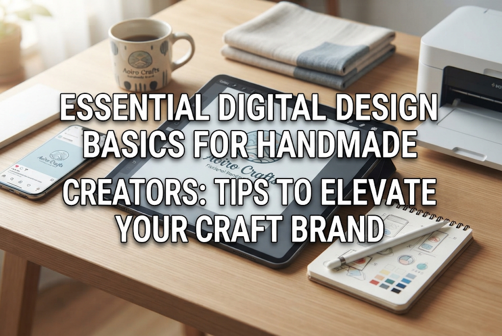
When making handmade items, have you ever thought, "I want to make my own shop cards," "I want to design a logo and print it on my work," or "I want to create an original pattern to print on fabric"?
Combining clean, well-structured digital design with the warmth of handcrafted items dramatically elevates the appeal of your brand. It not only boosts the quality of your products themselves, but also creates a striking impression through your packaging and promotional images.
However, when trying to create images on a smartphone or computer, many creators hit a wall with problems like: "The printed image turned out blurry," "The colors look completely different from what I saw on screen," or "There are so many file formats, I don't know which one to choose."
Digital design comes with its own unique rules and basic principles that differ from hand-drawing and physical crafting. If you proceed without knowing these basics, your carefully crafted designs might be rejected by print shops, or you might end up disappointed with the final printed goods.
So today, I will thoroughly explain the essential basics of digital design for beginners who want to start out and handmade artisans who want to integrate digital techniques into their work! I will break down technical jargon in an easy-to-understand way, so please read until the end and use these tips in your creative process!
In the world of handmade crafts, having digital design knowledge is a powerful asset. Rather than relying solely on manual crafting, combining your work with digital elements drastically expands your creative possibilities.
For instance, you will be able to design your own thank-you cards, care instructions, shop cards, and accessory display backing cards. While ready-made backing cards are fine, creating custom cards tailored to your brand logo and aesthetic instantly gives your work a professional finish.
Furthermore, based on your digital illustrations or created patterns, you can manufacture original merchandise such as acrylic keychains, pin buttons, custom-printed fabrics, and stickers.
One-of-a-kind hand-drawn pieces have incredible value, but leveraging digital data allows you to replicate the exact same quality consistently or order high-quality custom packaging from professional printing companies. To accurately convey the charm of your creations, let's master the fundamentals of digital design.
When starting digital design, the very first wall everyone encounters is "resolution." If you don't understand resolution correctly, it becomes the biggest cause of coarse, blurry images when printed.
Resolution is a numerical value that represents the density or level of detail in image data. Units like "dpi" (dots per inch) or "ppi" (pixels per inch) are used. This indicates how many dots or pixels are packed into a 1-inch (approx. 2.54 cm) square.
The higher the number, the finer and more beautiful the detail can be expressed. There are two essential numbers you must remember: 72 and 350.
When viewing images on a smartphone or computer screen, a resolution of 72 dpi looks very crisp. Because of this, if you take an image made for Instagram or web pages and use it directly for printing, it will lack the number of dots required by the printer.
Since the printer has to stretch out the missing dots, the outlines become jagged, and the overall print turns out blurry and pixelated.
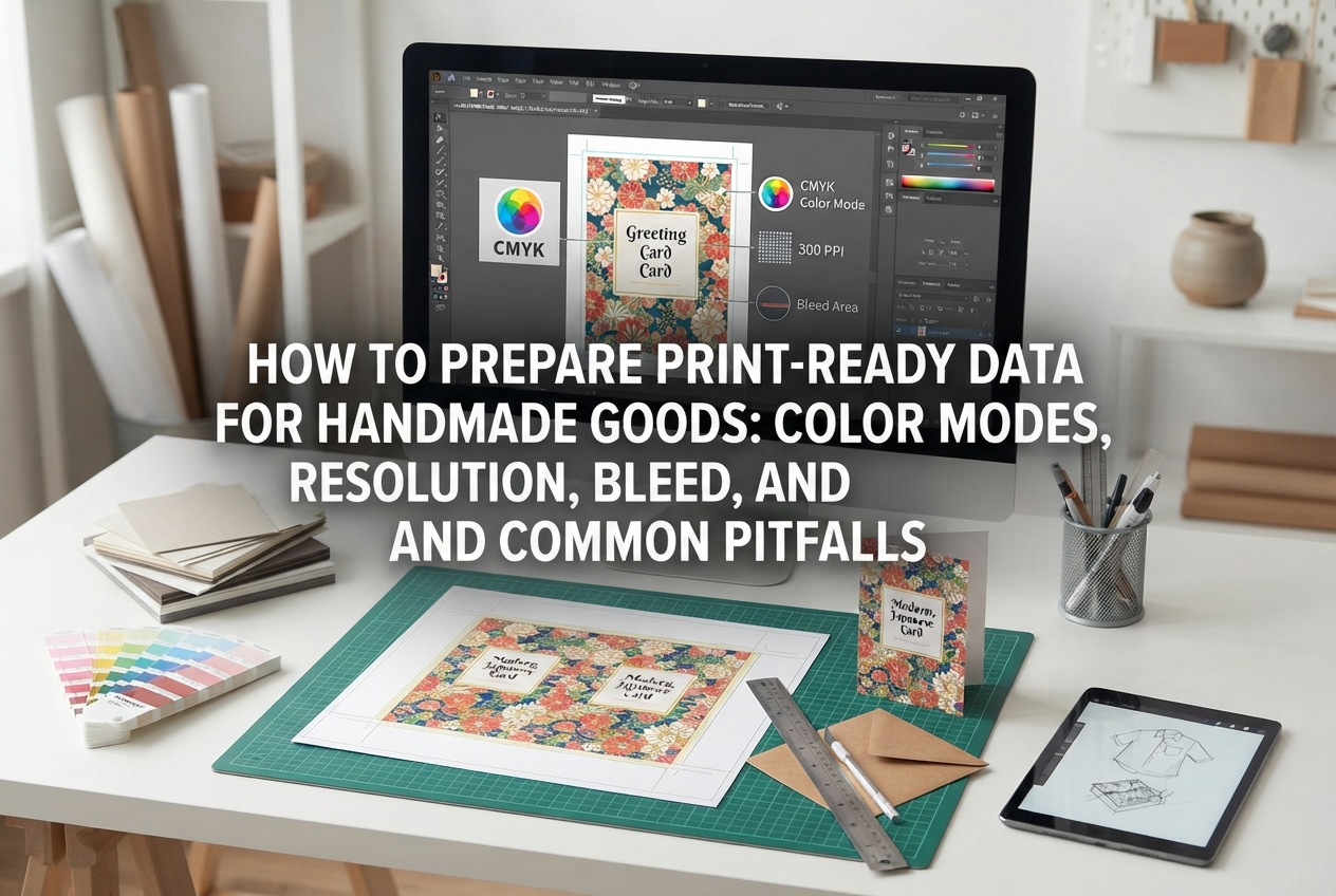
The most common mistake beginners make is assuming, "It looks great on my smartphone, so it should be fine," and sending small images to print. In digital design, when you create your canvas at the start of a project, always set it to "300 dpi (350 dpi for color printing)" if it is intended for print. Raising the resolution later will not make the image clear. Making it large from the beginning is an ironclad rule.
In digital design, color modes are just as crucial as resolution. There are two primary color modes: "RGB" and "CMYK."
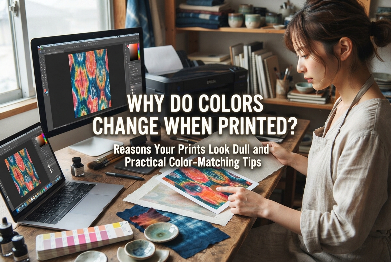
If you don't know the difference between these two, you might experience a major disappointment: "It was a vibrant pink on my PC screen, but when printed, it turned into a dull, muddy purple!"
RGB expresses colors by combining three colors of light: Red, Green, and Blue. Smartphone screens, computer monitors, and televisions all display colors using RGB.
The more light you mix together, the brighter it gets, eventually becoming white. Because it uses light to generate color, it can express extremely bright, vibrant shades like neon colors.
CMYK expresses colors by mixing four ink colors: Cyan (bright blue), Magenta (bright red-purple), Yellow, and Key plate (mainly black).
Home printers and large commercial printing presses all use these four ink colors to fix color onto paper and other materials. The more ink you mix together, the darker and muddier it gets, eventually resulting in a dark color close to black.
The key point to keep in mind is that "the color gamut that can be expressed in RGB (light) is overwhelmingly wider than what can be expressed in CMYK (ink)."
In short, no matter how beautiful a color looks on screen, there are colors that physically cannot be reproduced with printing inks. Vibrant neon colors or glowing emerald greens immediately turn into dull, subdued shades the moment they are converted to CMYK.
If you are designing digitally for print purposes, either set your color mode to "CMYK" from the beginning or adjust your design while previewing the color shifts that occur upon CMYK conversion.
Digital image data is broadly divided into two formats: "Raster data" and "Vector data." You need to choose between them depending on your design's purpose.
This image data is composed of tiny square dots (pixels) arranged seamlessly in a grid pattern. It excels at complex color gradations, such as photographs, digital illustrations, and watercolor paintings.
Representative file formats include JPEG and PNG.
The weakness of raster data is that when expanded, the dots are stretched out, causing the borders to become blurry or jagged. As a result, you cannot stretch and use raster images beyond the size set at the time of creation.
This data records lines and curves connecting points using numerical values and mathematical formulas. Software like Adobe Illustrator is famous for handling vector data.
Representative file formats include AI, SVG, and EPS.
The biggest advantage of vector data is that no matter how much you enlarge or reduce it, the outlines never blur and remain crisp and sharp. A logo used on a business-card-sized shop card can be enlarged to the size of a storefront sign or poster and still print perfectly.
For this reason, brand logos, shop names, fonts, and simple icon graphics made with text and symbols are globally standardized to be created as vector data.
File extensions (formats) used when saving are another point where beginners get confused. Let's organize the meanings and uses of the main file formats.
For example, if you want to create a custom product sticker where only the text and illustration are printed on a transparent background, you must save it as a PNG file with transparency processed, or as a vector PDF/AI file. If you save it as a JPEG, the background will automatically be filled in solid white, so be careful.
Once you understand the technical settings, let's look at visual design rules to make your work look beautiful. Design isn't just based on intuition; it follows clear logic and rules. By adhering to these rules, you can eliminate an amateur look and achieve a refined impression.
The biggest mistake beginners make is crowding too many elements onto the screen.
Placing text or images right up against the edges creates a cramped, difficult-to-read layout. Furthermore, when physical paper is cut during printing, the cutting position may shift by a few millimeters, risking having text written near the edges cut off.
Intentionally create wide margins around your design. White space is not just empty room; it is an important design element that guides the viewer's eye and highlights the central elements.
When you discover cute or stylish fonts, it's tempting to use many different types. However, mixing three or more font styles in a single design creates visual chaos and ruins cohesion.
Limit the fonts used within a single shop card or product label to 1 or 2 types. Using the same font for both main headlines and body text, while creating contrast through font weight (boldness) and size, is a fundamental technique for achieving visual unity.
Color selection also heavily influences the final design. Using too many colors leads to a lack of cohesion, so assemble your overall color balance with a maximum of three colors, keeping the following "golden ratio" in mind:
Using white or ivory as the base color (70%), your brand's key color (e.g., dusty pink) as the main color (25%), and a deep brown for text or small logo accents (5%) will result in a beautifully balanced design.
Here, I'll share some points where beginners often get stuck during actual work, along with how I (Yassy) personally make decisions and approach these workflows! These practical perspectives will help guide you when in doubt.
Smartphone and tablet apps these days are extremely powerful. Using apps like Canva or ibisPaint, you can create shop cards or social media images using just your phone.
[What I would do]:For social media posts or simple thank-you cards printed on a home printer, I frequently use smartphone apps alone! It's super convenient and fast.
However, if I am ordering professional business cards or packaging from a print shop, or creating a brand logo meant to last a lifetime, I always use a computer. On smartphone apps, fine-tuning resolution settings, converting to print-specified color modes (CMYK), and setting trim lines down to the millimeter can be difficult. Using the right tool for the right job is the smartest approach.
There are many stylish fonts and cute illustration assets available for free download on the internet. However, when using them for handmade craft sales, you must strictly check their "commercial use" license terms.
If you use assets that are not marked as "Commercial Use Allowed" on shop cards, product labels, or items for sale, it constitutes copyright infringement. Assets labeled "Personal Use Only" can only be used for personal, non-commercial hobbies.
[What I would do]:To avoid commercial licensing troubles, I read the creator's terms of service (license page) thoroughly before using any asset. I specifically check conditions such as "Can it be used on commercial product packaging?", "Can it be trademarked as a logo?", or "Is credit attribution required?".
I never use assets that fall into gray areas. I either use paid stock sites where commercial use is clearly permitted (such as Adobe Stock or Envato), Canva's commercially usable assets, or designs created entirely by myself.
When printing your designs, you might wonder whether to use your home inkjet printer or order from a print service.
[What I would do]:For items needed in small quantities or personalized note cards where text changes per order, I use a home printer. Modern home printers produce great quality if you choose good paper.
On the other hand, for hundreds of shop cards, thick sturdy backing cards, or full-bleed borderless stickers, I order from online print shops without hesitation. Commercial printers offer a lower cost per unit—even considering paper and ink costs—and above all, the finish quality and durability are vastly superior.
Here are user-friendly tools categorized by skill level for beginners starting their digital design journey.
A globally popular design tool that runs in web browsers and smartphone apps. It offers countless stylish templates created by professional designers, allowing you to create beautiful shop cards and thank-you cards instantly just by swapping text.
It also supports high-resolution PDF output for printing, making it the most recommended tool to start with.
If you want to digitize hand-drawn illustrations, drawing apps for smartphones and tablets are handy. ibisPaint is free and feature-rich, while Procreate (for iPad) is a highly intuitive, top-recommended paid app.
The secret to crisp prints is setting your canvas size to at least 3000 pixels or more and resolution to 300–350 dpi right from the start.
If you want to design original brand logos professionally, comply perfectly with print house submission formats, or scale up merchandise production, challenge yourself with industry-standard Adobe products.
Illustrator uses vector data, making it ideal for logos and layout designs, while Photoshop excels at photo editing, image correction, and watercolor-style illustration editing. Although it requires a monthly subscription, the freedom of creative expression is limitless.
Here is the concrete workflow for creating digital designs. Following this sequence prevents mistakes.
How text size feels on actual paper differs completely from how it looks on screen. Problems like "The text is much smaller than expected!" or "The colors turned out too dark!" can easily be caught and fixed during this test print stage.
In this guide, we explored the fundamentals of digital design tailored for handmade creators and beginners.
At first, technical terms like "resolution," "RGB vs. CMYK," and "file formats" might feel intimidating. However, as long as you remember these basic rules, you can completely avoid disappointing print mishaps!
Digital design is the ultimate partner to complement the warmth of handcrafted work, making your products look even more attractive and accurately communicating your brand's aesthetic to customers. Start small with accessible tools like Canva by making simple thank-you cards or shop stickers.
The thrill of holding your own designed logo or artwork beautifully printed on quality paper or merchandise is truly wonderful. Enjoy exploring digital design as you take your handmade crafting business to the next step!
If you found this helpful, sharing this article with your fellow craft friends on social media would mean the world to me!
Until next time, this was Yassy from Crafters!


For example, if you are looking for articles about mizuhiki, try searching for "mizuhiki"; if you are interested in tools, try keywords like "nippers" or "pliers."