Iron-On Transfers vs. Fabric Ink: The Complete Guide to Choosing the Right Craft Method
yassy
Crafters!

Hello, crafters! It’s Yassy! (・∀・)
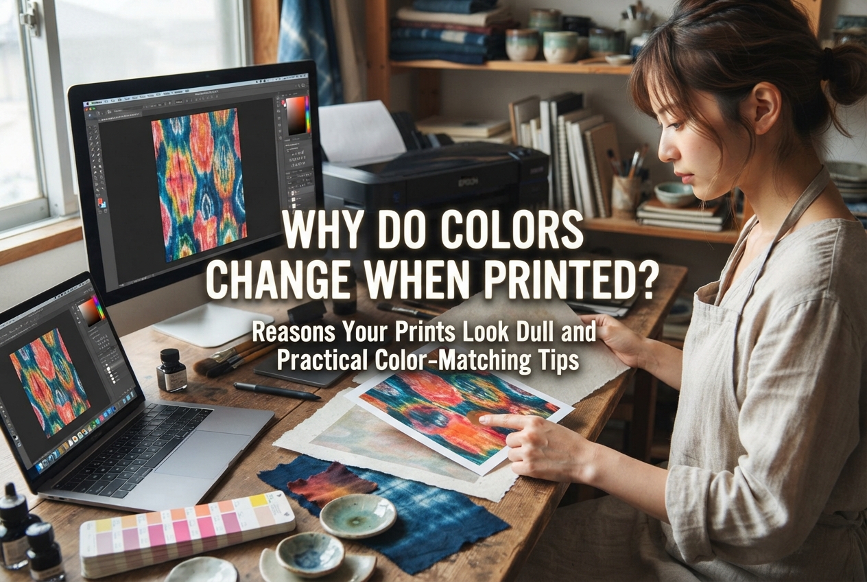
Have you ever spent hours designing an illustration, packaging label, or shop logo on your computer or smartphone, picked the absolute perfect palette, and hit “Print” on your home inkjet printer—only to feel crushed by the result?
On your screen, the pink was luminous and the mint green was crisp and vibrant. On paper, however, the whole image looks murky, dark, or unexpectedly bluish. This frustrating gap between display and print is one of the most common hurdles makers face when creating handmade items, thank-you cards, and packaging.
It’s natural to wonder, “Is my printer broken?” or “Is something wrong with the ink?” But in most cases, your hardware is working just fine. The mismatch happens because the way screens display light and the way ink absorbs and reflects light on paper are fundamentally different. It is an inevitable physical phenomenon.
In this guide, we will break down why colors shift during printing and explore practical, real-world techniques to help you achieve the lovely, vibrant prints your handmade creations deserve!
The primary reason for color discrepancies lies in the medium: digital displays emit light, while printed paper reflects ambient light back to your eyes.
Your screen shines colored light directly into your retinas. A printout, on the other hand, relies on the ambient lighting in your room bouncing off the paper's surface. Understanding this basic difference is the first step toward troubleshooting print colors.
In reality, color shifts are rarely caused by just one factor. Instead, they stem from an interplay of four main elements:
Let’s examine each of these factors in detail.
The single biggest cause of color shifting is the color mode used by digital files versus printers.
Smartphones, computer monitors, and tablets render imagery using the RGB color model:
These are the three primary colors of light. When you blend light together, it becomes brighter, ultimately turning pure white when all three wavelengths combine at full intensity (additive mixing). Because screens project light directly, they can display brilliant neon tones, fluorescent accents, and crisp, translucent pastels with remarkable vibrancy.
In contrast, desktop printers and commercial presses rely on CMYK:
These are the primary colors of pigment, plus black ink for depth. Just like mixing paints on a palette, the more pigments you layer, the more light they absorb, causing the mixture to turn darker until it reaches a dark, muddy tone (subtractive mixing).
RGB and CMYK have vastly different reproducible ranges, known as a color gamut. The RGB color space is significantly broader than CMYK. There are many luminous colors—such as hot neon pinks, electric limes, piercing cyans, and intense violets—that ink simply cannot reproduce.
When you send an RGB image to a home printer, the printer software evaluates the data and determines: “This glowing color cannot be printed with physical ink, so I will substitute it with the closest matching shade available in CMYK.”
During that automatic conversion, the brilliant light drops out, leaving behind a flatter, more muted ink tone. That is why prints can suddenly appear dull or muddy.
Even if you keep the same printer, ink cartridges, and file, switching your paper stock can dramatically alter the printed result.
Paper impacts color reproduction across three main areas: the base whiteness of the sheet, its surface texture, and how quickly it absorbs liquid ink.
Printer inks (with the exception of opaque black) are largely translucent. When ink is deposited onto a page, the underlying color of the paper shows through the ink layer.
Printing on a bright, cool-toned white paper will yield crisp, sharp colors with a modern feel. Printing on a cream, ivory, or natural white stock will give the piece a warmer, more muted, vintage tone. If you print on colored surfaces like kraft paper or textured traditional Japanese washi, the paper’s natural tint blends entirely with the ink pigments, shifting the palette completely.
Surface treatments on paper also dictate how ink settles:
Even if your artwork looks flawless on your screen, printing it on standard multipurpose copy paper will cause the wet ink to wick down into the raw pulp fibers, softening contrast and making deep tones appear faded.
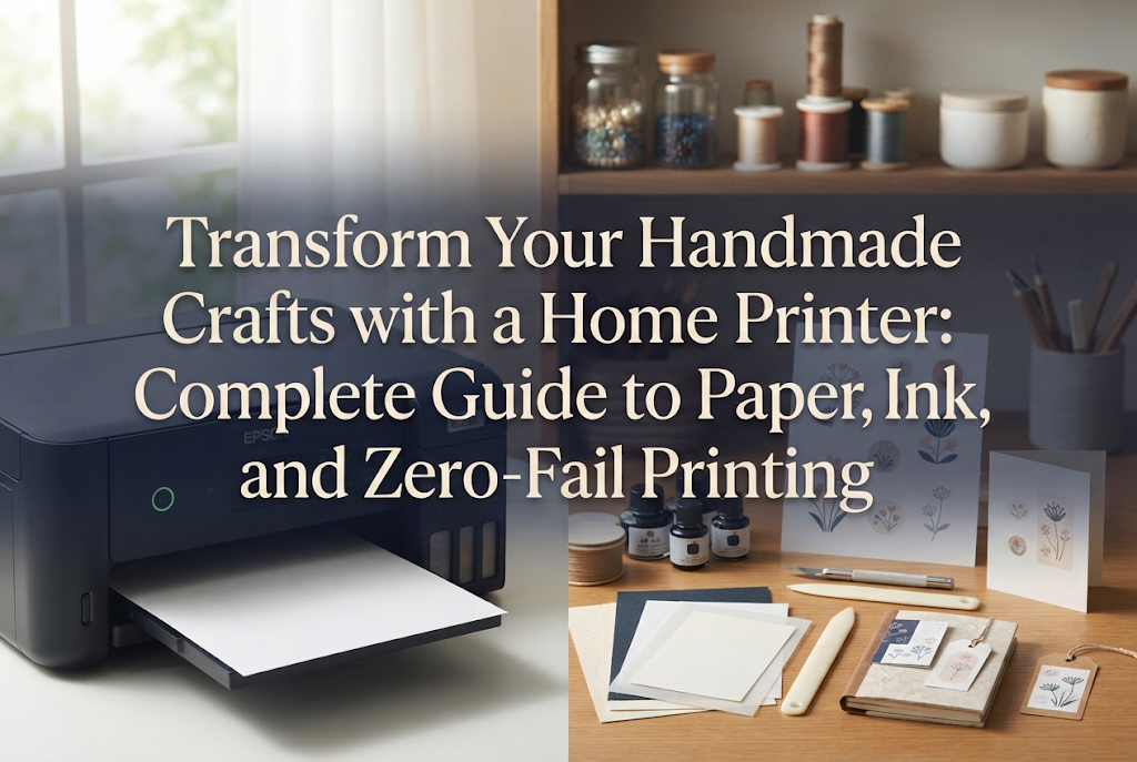
The chemical composition of your printer’s ink also affects color behavior. Most consumer inkjet printers use dye-based ink, pigment-based ink, or a hybrid combination of the two.
Dye ink consists of fully dissolved colorants in a liquid base that sink slightly into the paper's coating. It offers high transparency and rich color saturation. When paired with photo papers or glossy stocks, dye ink renders smooth gradients and exceptionally vivid hues.
However, when used on standard uncoated paper, dye ink can bleed slightly along the fibers, softening sharp details.
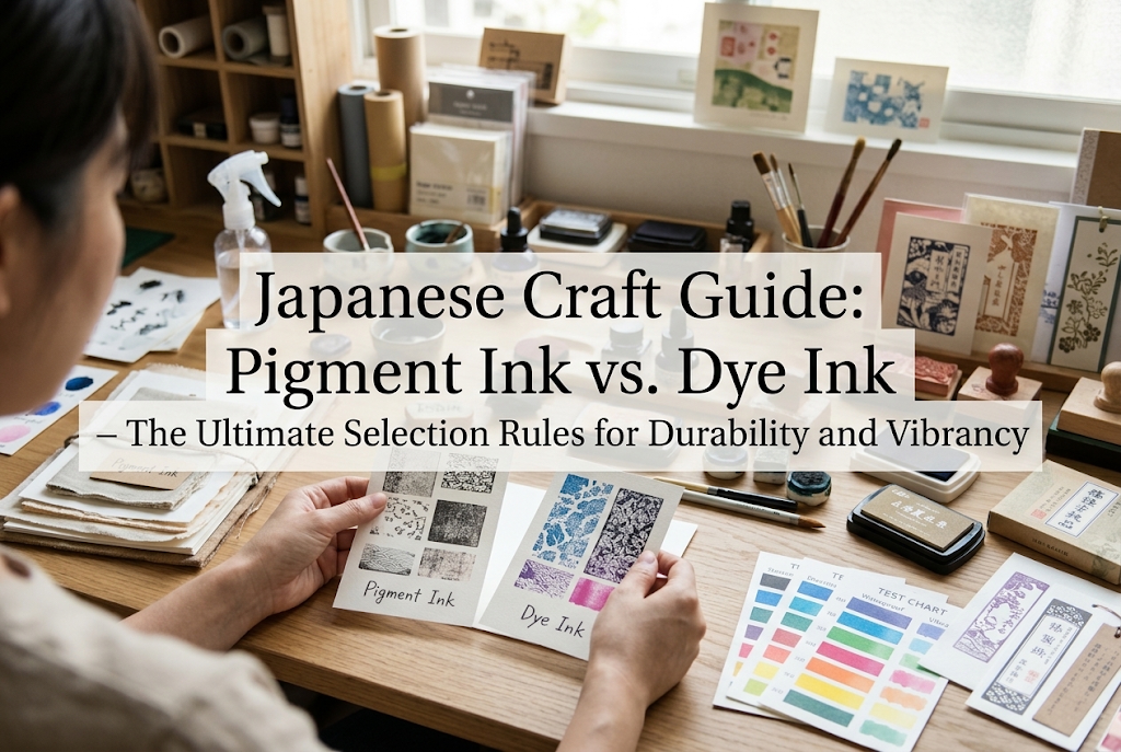
Pigment ink consists of microscopic solid color particles suspended in liquid, which sit directly on top of the paper fibers once dry. It delivers exceptionally sharp linework and crisp lettering without bleeding. In addition, pigment ink is highly resistant to water and UV fading—a massive advantage for handmade goods that need long-term durability.
On the other hand, pigment inks generally have a slightly lower saturation ceiling and less translucence than dye inks, leaning toward a velvety, matte finish. Outputting an image prepared for dye ink onto a pigment printer can make the design feel somewhat darker or more subdued.
Sometimes the issue is purely mechanical. For example, if your yellow printhead nozzle becomes clogged and stops firing, the printer will proceed without yellow, turning what should be warm tones into cold purples, blues, or dull greens.
If your prints suddenly take on a strong color cast or an entire color range disappears, run a nozzle check print from your printer’s maintenance menu to verify that every channel is firing cleanly.
In many instances, the print is technically accurate, but the monitor you used to view the file was presenting an overly boosted representation of reality.
Out of the box, most computer monitors, laptops, and tablets are tuned to very high brightness and saturation levels so streaming video and photos look punchy.
When an image looks “just right” on an ultra-bright monitor, that perceived balance is heavily subsidized by the backlight. Because paper cannot emit its own light, the printed version immediately appears one or two stops darker and less vibrant.
Modern mobile phones frequently feature OLED displays with automatic contrast enhancement and vibrant color profiles. Designing an artwork strictly on a phone screen can create unrealistic expectations for how pigments will behave on physical paper.
Now that we understand the causes behind color shifts, let’s explore actionable steps to align your physical prints with your creative vision.
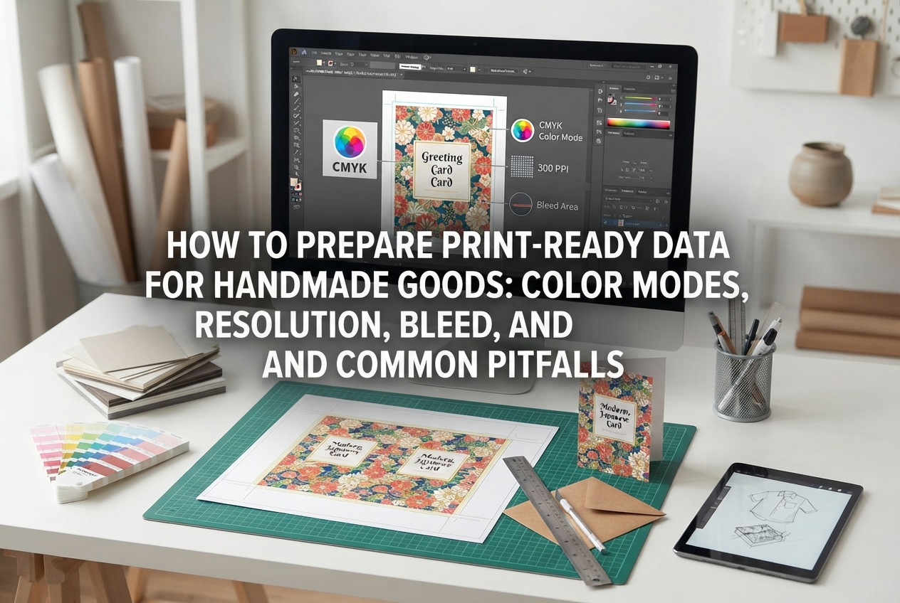
If you are working in creative design tools such as Adobe Photoshop, Illustrator, or Clip Studio Paint, set your canvas color profile to CMYK before you start designing.
Designing within CMYK confines your working palette to colors that physical inks can actually recreate. You avoid using unprintable neon tones early on, sparing yourself the disappointment of an automatic color shift later.
Note: Many beginner-friendly design apps and mobile tools lock files to RGB by default. If your software does not support CMYK creation, rely on the manual adjustments and proofing steps below.
When preparing designs for print, lower your display's brightness.
A helpful approach is to set your screen to roughly 50% to 60% brightness, adjusting until the white background on your screen matches the brightness of a clean sheet of white paper held right next to the display in your workspace lighting. This simple tweak immediately cuts down on unexpectedly dark printouts.
When the print dialog box opens, take a moment to confirm the selected paper type.
If you feed glossy paper into your machine while the driver remains set to “Plain Paper,” the printer will spray the incorrect volume of ink at the wrong delivery speed, causing washed-out tones or heavy puddling.
Your printer adjusts ink droplet volume, drying intervals, and pass density based on this setting. Always ensure your physical paper and printer profile align.
Because converting an RGB image to print inevitably causes a drop in visual luminosity, you can counteract this by applying a slight compensatory adjustment right before sending the file to the printer:
While the design might look slightly overexposed or overly punchy on your backlight-assisted monitor, those boosted values will settle into a balanced, vibrant tone once rendered in ink on paper.
Here are a few personal workflow habits I rely on when producing packaging, tags, and art cards for my handmade work:
My top recommendation for any maker is to print a dedicated color chart using your own printer on your specific paper of choice.
Create a test grid in your software featuring swatches of reds, blues, yellows, greens, pastels, and neutrals with their exact RGB or CMYK values labeled underneath. Print this grid on the exact matte or specialty paper you use for your products.
Keep that physical printout on your desk. When choosing colors in your design app, reference the physical swatch rather than trusting the screen. You will know in advance precisely how that color looks in real ink, eliminating wasted paper and ink.
Even seasoned professionals rarely hit the bullseye on the very first try without proofing.
Before you run an entire batch of 50 product backer cards or 100 business cards, print a single test proof on your actual project stock. Running a test on plain copy paper won't give you accurate feedback if your final product uses heavy textured cardstock or premium matte paper.
Using a single sheet for testing might feel slightly wasteful in the moment, but it saves you from ruining dozens of expensive sheets later.
A common pitfall for crafters is obsessing over matching the screen with microscopic precision.
Remember: glowing pixels and pigmented paper fibers are different physical mediums. An exact 1:1 match is physically impossible. What truly matters is whether the physical printed piece looks charming, well-balanced, and high-quality when held in someone's hands.
Printed paper possesses warmth, tactile charm, and subtle depth that a cold glass screen cannot replicate. Try stepping away from the monitor, holding your print in natural light, and evaluating it as a standalone piece of craftwork.
To recap our main takeaways:
Understanding how ink and paper interact takes the guesswork out of home printing. By setting up your files thoughtfully and keeping physical swatch references handy, you can consistently produce beautiful, professional-looking paper goods for your creative projects! (・∀・)
If you found this guide helpful, please share it with your fellow makers and crafting communities. Until next time, happy crafting—this has been Yassy from Crafters!


For example, if you are looking for articles about mizuhiki, try searching for "mizuhiki"; if you are interested in tools, try keywords like "nippers" or "pliers."