The Best First Projects for Digital Craft Beginners & How to Avoid Common Printing Mistakes
yassy
Crafters!

Hello! This is Yassy from Crafters! (・∀・)
When you create and sell handmade crafts, you inevitably encounter situations where you need to create digital print files—whether for jewelry display cards, business cards, branded stickers, packaging labels, or custom goods featuring your own original illustrations.
Have you ever run into frustrating issues like these?
Many crafters have experienced these exact printing mishaps. The truth is that digital images designed for viewing on screens follow completely different technical rules from "print-ready data" designed to be pressed onto paper and physical goods.
If you design without knowing these print-specific rules, even the most beautiful layout can turn out disappointingly flawed in physical form.
In this guide, I will thoroughly explain the essentials of preparing print data for handmade crafts—from foundational principles and exact technical settings to step-by-step setup guides, practical tips, and common pitfalls to avoid. Master the fundamentals and create gorgeous paper stationery and printed packaging exactly as you envisioned!
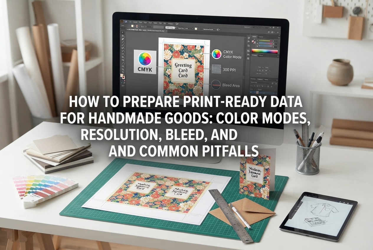
When preparing files for physical printing, there are three absolute rules that differ fundamentally from creating graphics for screens. Understanding these three principles is the fastest way to avoid costly printing errors.
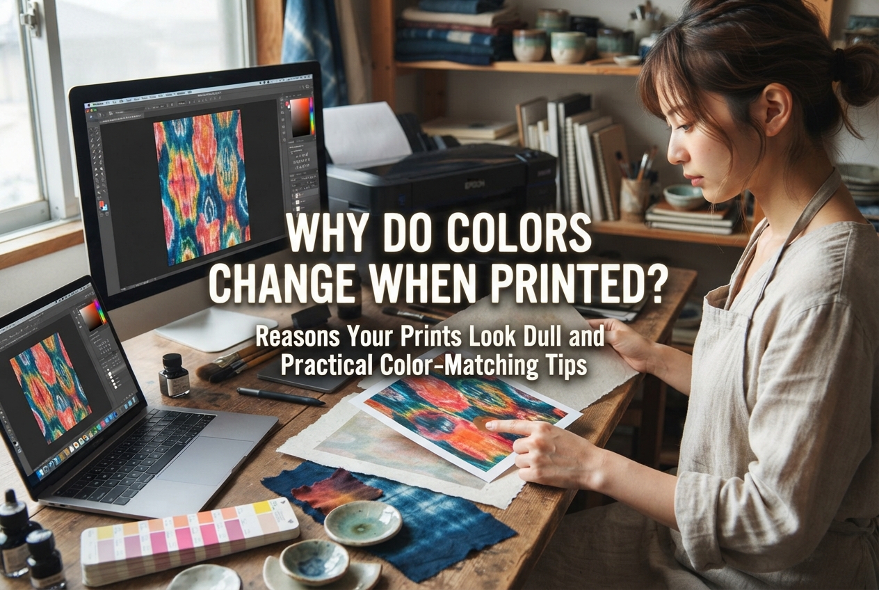
The first fundamental rule is setting your color mode correctly. Images displayed on smartphone and computer monitors use RGB (Red, Green, Blue) light. RGB operates on an "additive color mixing" principle, where mixing colors together makes them brighter, culminating in pure white.
In contrast, commercial presses and home printers use CMYK (Cyan, Magenta, Yellow, Key/Black) physical inks or toners. Inks operate on a "subtractive color mixing" principle, where mixing pigments together makes the color darker and denser.
Here lies the key challenge: RGB light can reproduce a significantly broader color spectrum (gamut) than ink, allowing for neon-bright and highly saturated shades. CMYK inks physically cannot reproduce that same high level of vivid saturation. If you send a vibrant RGB file straight to a printer, the printing machine automatically converts it to the closest CMYK equivalent, often resulting in noticeably muted, darker tones.
Always set your document's color mode to CMYK at the very beginning when starting your design. Working within a CMYK color space from the start minimizes the visual gap between what you see on your monitor and what appears on the final printed paper.
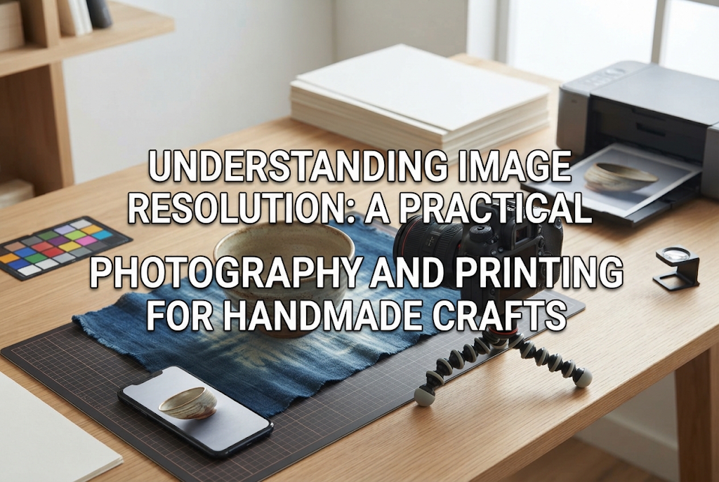
The second golden rule is resolution, measured in dpi (dots per inch). This number indicates how many individual dots of detail fit within one linear inch (approx. 2.54 cm). A higher number produces crisp, smooth imagery, while a lower number produces visible pixels and jagged edges.
Graphics made for websites and social media are typically created at 72 dpi or 96 dpi. While they look sharp on digital displays, printing a 72 dpi file onto paper results in blurry details and jagged lines.
The universal standard for high-quality full-color printing is 350 dpi (for pure black-and-white line art or text-only prints, 600 dpi to 1200 dpi is sometimes recommended). Whenever you design full-color illustration cards, photos, or branded business cards, setting your resolution to 350 dpi is essential. When creating your canvas, always verify that the resolution box says "350" and the unit is set to "dpi" (or "ppi").
The third rule is bleed—known as nuritashi or dobu in Japan. Commercial printers print multiple designs across large master paper sheets, which are then trimmed down to the designated finished size using heavy-duty industrial cutting blades.
During this cutting process, tiny physical shifts—measuring fractions of a millimeter up to a full millimeter—naturally happen due to paper elasticity and machine vibration.
If your background color or image ends exactly at the final trim line, even a microscopic shift outward during trimming will expose an unprinted white line along the edge. To prevent this unwanted white gap, you must extend your background artwork outward by 3 mm on all four sides (top, bottom, left, and right). This extra 3 mm margin is called the "bleed."
For example, if you are designing a standard Japanese business card size (91 mm × 55 mm), your full canvas size including bleed must be set to 97 mm × 61 mm (+6 mm to both width and height). Ensuring your background pattern or color extends all the way to this outer boundary is an absolute necessity.
Here is how to set up your print-ready file using graphic software or digital drawing tools like Illustrator, Photoshop, CLIP STUDIO PAINT, or Canva.
When starting a new project, the very first step is setting your canvas dimensions. Open your design program and bring up the "New Document" window.
Make sure to change the unit of measurement from pixels (px) to millimeters (mm). Print materials are calculated in real-world physical measurements; using pixels makes sizing calculations unnecessarily complicated and leads to scaling mistakes.
Enter the following parameters:
Here are practical calculations for common craft stationery formats:
Example 1: Postcard (100 mm × 148 mm)・Finished trim size: 100 mm × 148 mm・Bleed allowance: +6 mm width, +6 mm height・Canvas document setup: 106 mm × 154 mm
Example 2: Square Jewelry Card (50 mm × 50 mm)・Finished trim size: 50 mm × 50 mm・Canvas document setup with bleed: 56 mm × 56 mm
Remembering the rule of thumb—"add 6 mm to both width and height"—makes calculating sizes straightforward.
While background artwork must extend outward into the 3 mm bleed area, essential design elements—such as brand logos, shop names, contact details, and key illustrations—require the opposite treatment.
Because slight shifting occurs during cutting, placing critical text right along the trim edge risks having it sliced off or looking awkwardly cramped against the paper border.
Keep all vital text and design elements at least 2 mm to 3 mm inside the trim line. This protected inner area is called the "safe zone." Set up guide lines 3 mm inside the trim line on your canvas, and keep all crucial information safely contained within them.
Here are typical mistakes beginners often encounter, along with practical solutions to ensure a clean result.
A very frequent issue is: "I created my canvas at 350 dpi, but the photo or logo mark I placed inside printed out blurry."
This happens when the individual image placed into the document has a low source resolution. Even if the canvas is configured to 350 dpi, pasting a 72 dpi web graphic or a compressed photo downloaded from a messaging app will print with low-resolution artifacts. Always use uncompressed, high-resolution original files. When working with photography, import the original full-size photo taken on your camera or phone, then scale it down on your canvas rather than enlarging a small graphic.
When sending files to an outside print shop or opening them on a different computer, text layouts can break and fonts can substitute into standard system fonts.
If the computer at the print shop does not have your chosen font installed, the operating system will automatically replace it, ruining your design. To prevent this, convert all typography into vector shapes—a process called creating outlines.
If you use vector software like Adobe Illustrator, select all text before exporting and run "Create Outlines." In raster-based illustration software or Photoshop, rasterize your text layers to lock the typography into pixels.
Note: Once you outline or rasterize text, you cannot edit the wording. Always save an editable working copy under a different file name before outlining your final version.
Fine details that look sharp on a high-definition monitor do not always transfer cleanly to paper, especially when dealing with hair-thin lines and heavy black ink.
When drawing decorative borders or diagrams on small inserts, setting an ultra-thin stroke like 0.1 pt risks vanishing entirely or printing as broken dashes. For reliable reproduction, keep line widths at a minimum of 0.25 pt (approx. 0.09 mm).
Additionally, avoid using "rich black" (CMYK all set to 100%) for small typography or delicate linework. Applying 400% total ink coverage causes ink to bleed into the paper fibers, smudge during handling, or show through the reverse side. For crisp, legible small text, specify black as 100% K only (single-channel black).
Here are tailored strategies for the types of printed items crafters create most frequently, including practical habits I rely on in my own work.
Display cards for earrings and accessories require planning for punched holes, slits, and hardware placement.
When I design display cards, I place temporary guide markers for earring hole locations on a dedicated, separate layer. I measure my physical jewelry findings in advance to verify that earring posts, clips, or dangling components will not cover up the brand logo, shop URL, or social media handles.
A display card's role is to support and showcase your work. Rather than overcrowding the background with loud graphics, balance your layout with generous negative space that highlights the handmade piece itself.
When preparing custom sticker and label files for boxes and packages, pay close attention to the paper texture and background color.
If you print on brown kraft paper label stock, standard printers do not lay down white ink unless you order specialized white-ink printing. The kraft paper's brown tone will show straight through any unprinted white areas and alter transparent inks.
Light pastel shades easily get swallowed up by brown kraft or clear sticker backgrounds. Choosing rich, high-contrast colors like deep brown, solid black, or navy produces clean, readable labels on textured substrates.
Turning illustrations into acrylic charms or custom-shaped die-cut stickers requires two supplementary layers beyond your standard color artwork: a cut line and a white base layer (white underprint).
Always download the print vendor's official design template (for Illustrator or Photoshop) and save your artwork across their designated layer names (such as "design," "cutline," and "white").
The ideal export format depends on whether you print at home or submit files to a commercial printing company.
For home inkjet or laser printers, the most reliable and user-friendly formats are Print-Quality PDF or high-resolution PNG.
Exporting as a high-quality PDF preserves sharp text and vector elements. When using tools like Canva, select "PDF Print" and choose CMYK if available (or high-quality RGB if using free plans).
Modern home printer drivers are optimized to convert RGB photo data accurately onto photo paper. For home setups, RGB files often reproduce surprisingly well. Always perform a test print on standard paper first to check color rendering before using your specialty cardstock.
Commercial print houses have specific entry requirements that you must follow closely. Typical accepted formats include:
Use this convenient checklist when initiating your project and right before submitting your final export:
Creating print-ready data might feel intimidating with technical terms like "CMYK," "350 dpi," and "3 mm bleed," but once you grasp the basic principles, the process becomes second nature.
These rules exist simply to ensure that your physical paper goods, labels, and packaging arrive looking just as polished and charming as your handmade creations. I still remember the excitement of receiving my very first batch of professionally printed shop cards with perfect colors and razor-sharp text.
Use the settings and step-by-step guidance in this article to build your print files with confidence!
If you found this guide helpful, please share it with your fellow makers and craft friends. See you in the next article! This was Yassy from Crafters!


For example, if you are looking for articles about mizuhiki, try searching for "mizuhiki"; if you are interested in tools, try keywords like "nippers" or "pliers."