Beyond the Starter Kit: The Golden Order for Upgrading Japanese Clay Craft Tools
yassy
Crafters!
Hello, everyone! I'm Yassy from Crafters! (・∀・)
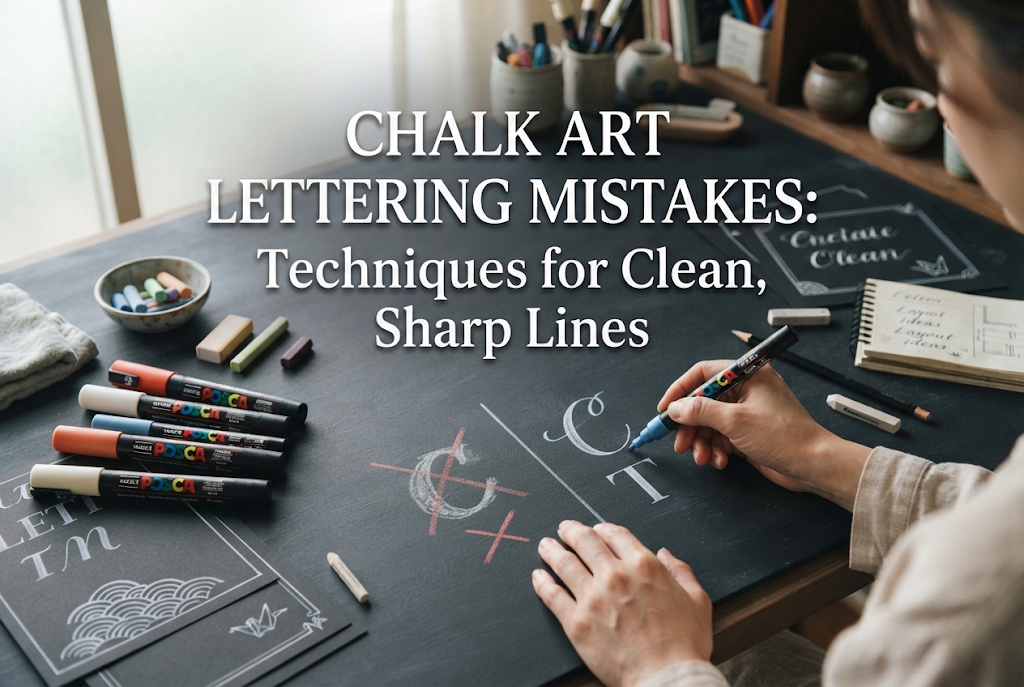
Chalk art is incredibly popular for cafe menu boards and interior home decor. Seeing vibrant pastel color gradients paired with stylish English lettering or messages always brings a sense of excitement. However, when trying it out for yourself, many people hit a wall: "I drew the illustration well, but as soon as I added the letters, it looked amateurish," or "My lines are wobbly and uneven."
Lettering is a crucial element that dramatically influences the overall impression of a board or artwork. When the text looks crisp and polished, the quality of your entire piece instantly leaps up. In this article, I will thoroughly break down the root causes of messy chalk art lettering and share clear solutions so anyone can achieve the sharp, beautiful lettering they admire!
When lettering doesn't turn out well in chalk art, many people assume, "I'm just clumsy" or "My handwriting is terrible." But that is a huge misconception! Messy lettering in chalk art isn't caused by a lack of natural talent or artistic sense; it comes down to your process and how you handle your oil pastels. The main issues usually stem from four core causes:
Oil pastels, commonly used in chalk art, are soft and thick compared to standard crayons or paints. If you try to write letters using a brand-new pastel or a dull, rounded tip right after coloring a large section, your lines will inevitably turn out thick, with rounded edges that look blurry.
To write fine text or crisp alphabet characters, you must stay conscious of using the sharp "corners" of your pastel at all times. Forcing a rounded tip to draw thin lines by applying heavy pressure not only thickens the lines further, but it also deposits an overly thick coat of pastel onto the board, causing the letter shapes to collapse even more.
Even crafters who carefully sketch out their illustrations beforehand often fall into the trap of thinking, "I can just write these simple English letters freehand." This is one of the biggest pitfalls in chalk art.
Freehand text easily loses horizontal alignment, slanting upward or downward, while the spacing between characters (kerning) becomes uneven. No matter how meticulously you color each individual letter, if the overall placement and tilt are off, the human eye will instantly perceive it as "messy."
One of the highlights of chalk art is "blending"—rubbing and smoothing the applied oil pastel with the pad of your finger. While this technique creates wonderful gradients for fruits or flowers in illustrations, using your fingers for lettering can backfire.
If you forcefully smudge right up to the edges of your letters with a thick finger, the pastel will bleed past the boundaries, making the lines look blurry and thick. What lettering truly needs is "crisp, sharp boundaries." Moving your fingers in circles to blend, as you would for an illustration, is a primary reason lettering ends up looking unrefined.
Oil pastels change dramatically in color intensity and line width depending on how much pressure you apply. If there is unnecessary tension in your wrist or arm, the start of a stroke might turn out extremely thick, or the line might break and stutter midway through.
Curved letters in the alphabet (such as "S" or "C") are particularly prone to unnatural variations in thickness if your pressure isn't consistent. Pushing hard onto the blackboard as if writing on paper with a pen will crush the oil pastel, leaving thick, messy clumps behind.
Let's organize the specific points where beginners often get confused or stuck when lettering. Simply understanding these traps will help you dramatically reduce avoidable mistakes.
Just like using everyday writing tools, some try to complete chalk art letters in a single line. However, creating letters in chalk art is closer to "drawing/painting" than it is to standard "writing."
Instead of trying to finish a letter with one thick line right away, the correct approach is to first draw a thin outline of the letter and then carefully fill in the inside. Attempting a single-stroke approach leaves you at the mercy of the pastel's thickness, making it impossible to control line variation.
Writing English words in your everyday personal handwriting won't yield that trendy chalk art aesthetic. Chalk art lettering relies on distinct font styles, such as "Serif" (like Mincho), "Sans-Serif" (like Gothic), or flowing "Script" (cursive).
If you attempt to write based purely on intuition without understanding basic lettering rules—such as which strokes should be thick and which should be thin—the overall balance will look awkward and amateurish.
Now that we know the causes, let's explore practical techniques to make your chalk art text look strikingly beautiful and sharp. These are methods you can try right away!
Set aside freehand writing for a moment. The most reliable and precise way to produce beautiful lettering is to design your text on a computer using your favorite fonts, print it onto paper, and transfer it to your board.
By following this process, a perfectly aligned guideline will appear on your board. Once your outline is accurate, all you need to do is apply your oil pastels along those lines, boosting your final quality tremendously.
Before starting your lettering, maintain the tips of your oil pastels. If the edges are rounded, use a utility knife to sharpen the tip like a pencil or slice it diagonally to create a crisp angle.
Always keep a sharp edge touching the board. Get into the habit of rotating the pastel 90 degrees as you work so you are constantly using a fresh corner; this allows you to maintain clean, thin lines consistently.
There's no need to assume that every single line must be drawn exclusively with oil pastels. For small text or ultra-thin decorative lines, using a pencil-style white charcoal pencil (chaco pencil) or a fine silky chalk pen is a common technique used even by professionals.
Additionally, after writing with oil pastels, clean up any messy edges or stray marks by using a black oil pastel or a black correction marker to trim away imperfections from the outside. Refining the shape of your letters using the black background—a sort of "subtractive correction"—creates razor-sharp edges.
When creating gradients inside your letters or blending smaller text, avoid using your fingers. Fingers are simply too thick for precise detail work.
I highly recommend using cotton swabs. Tightly pinch and shape the tip of a cotton swab, then carefully blend only the inner areas of the letters. By stopping just short of the outer edge, you can keep the outlines crisp while achieving a smooth color transition inside.
Here, I'd like to share my mindset and specific steps when doing chalk art lettering as Yassy!
For me, lettering isn't just the "final touch"—I treat it as the main core of the design and establish the guide placement right at the start. Trying to squeeze text into leftover spaces after finishing an illustration often leads to cramped, undersized text and guaranteed mistakes.
Here is my exact step-by-step workflow:
In my process, I spend the most time on "shaping the edges with black pastel." Pastel lines naturally tend to look soft and slightly thick, so shaving them down with black pastel gives a clean, chiseled finish. Adding this subtractive step removes the amateur look instantly, giving your piece a professional shop-board feel!
Here are basic tips for rendering three popular font styles frequently used in chalk art.
These are clean fonts without decorative flourishes at the stroke ends. They offer high legibility and a crisp, modern feel.
Key Tip: Keeping the line thickness uniform between vertical and horizontal strokes is essential. If vertical lines are thick while horizontal lines are thin, the letter loses balance. Use a ruler to align stroke heights precisely and keep the corners sharp rather than rounded.
A classic style featuring small decorative feet ("serifs") at the end of strokes. Perfect for creating a stylish cafe atmosphere.
Key Tip: Create clear contrast by making vertical strokes thick and horizontal strokes thin. Pay attention to stroke weight dynamics and render the delicate serif accents carefully using a cotton swab or a sharp pastel tip for an elegant finish.
Defined by flowing, elegant curves, this style adds a handmade, warm feel to your artwork.
Key Tip: The golden rule is "downstrokes (moving downward) are thick, and upstrokes (moving upward) are thin." Simply keeping this weight contrast in mind will give your text an authentic calligraphic look.
If you find lettering difficult, reviewing your tools and work environment can make a huge difference.
Oil pastels range from ultra-soft types to slightly harder varieties. While ultra-soft pastels offer vibrant colors and effortless blending, they make maintaining fine detail for text challenging.
If your text keeps blurring, try introducing slightly firmer oil pastels or pastel pencils specifically for lettering. Harder mediums hold their sharp tips longer, making fine lines significantly easier to control.
When using handmade blackboards, any bumps or paint lumps on the painted surface can catch the pastel tip, causing jagged lines.
When making your own board, lightly sand the dried paint surface with fine sandpaper to create a smooth finish. A smooth, well-prepared surface allows the pastel to glide effortlessly, making straight, crisp letters much easier to write.
We've covered the root causes of messy chalk art lettering along with practical solutions to fix them.
Difficulty with lettering isn't due to a lack of artistic flair. It usually stems from process habits—like not using the pastel's sharp corners, skipping proper transfer guidelines, or smudging outlines with your fingers.
By keeping these points in mind and practicing, you'll be able to create strikingly sharp chalk art text that looks like it was drawn by a pro! Crisp lettering makes the craft process even more rewarding. Give these techniques a try on your next project!
If you found this helpful, sharing this article with your crafting friends on social media would mean the world to me and keep me motivated!
Until next time, happy crafting! This was Yassy from Crafters!
For example, if you are looking for articles about mizuhiki, try searching for "mizuhiki"; if you are interested in tools, try keywords like "nippers" or "pliers."