Level Up from Starter Kits: The Golden Sequence for Upgrading Fabric Dyeing Tools
yassy
Crafters!

Hello, everyone! It’s Yassy from Crafters! (・∀・)
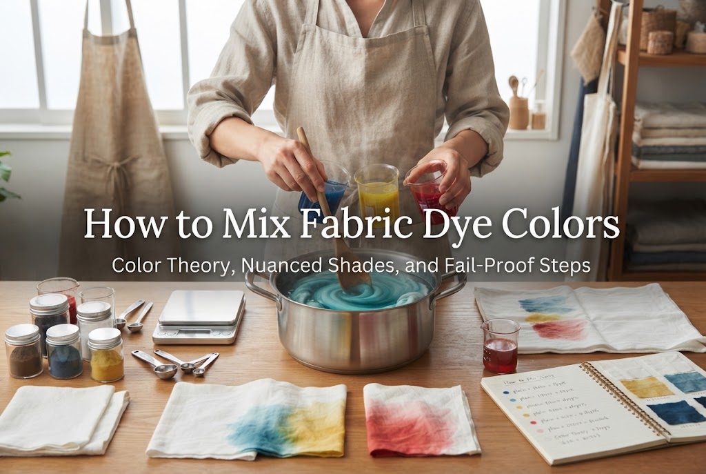
Have you ever used commercial fabric dyes and thought, “I wish this pink was a little softer,” or “I want a deeper, more nuanced green”? When working with off-the-shelf basic dyes, it is common to find that the exact shade you envision simply isn’t in the pack.
That is the perfect time to try mixing your own custom dye colors! Once you master the fundamentals of blending dyes, your creative palette becomes virtually limitless.
However, many crafters run into frustrating issues: “I mixed a few colors casually and ended up with a muddy brown,” or “The dried fabric looked completely different from what I aimed for.” Mixing fabric dye follows crucial principles that are quite different from mixing paints on paper.
In this guide, I will thoroughly explain the essential principles of color mixing for fabric dyeing, fail-proof techniques to blend your dyes, and practical tips to create exquisite, trendy nuance colors!
Before mixing dyes, the first thing to understand is how fabric dye fundamentally differs from opaque paint. Without grasping this concept, it is easy to run into unexpected results no matter how carefully you work.
While craft paints sit as an opaque film on top of a surface, fabric dyes are transparent liquids that penetrate deep into the fibers. Because of this transparency, fabric dye mixing has three unique characteristics:
By blending the three primary dye colors—Cyan (bright blue), Magenta (red-violet), and Yellow—you can theoretically create any hue. However, every time you add another color, less light is reflected, causing the tone to shift toward a darker, grayer shade.
Furthermore, dyeing a pure white fabric versus a light beige or pale gray fabric will yield entirely different results even with the exact same dye bath. Always remember that the fabric’s natural base color effectively acts as your “first dye color.”
Additionally, wet fabric submerged in the dye bath appears 1 to 2 shades darker than its dry state. If you adjust your dye bath to match your target shade while the fabric is wet, you will likely be disappointed by a much lighter result once it dries.
To recreate your target colors accurately instead of relying solely on intuition, gathering the right measuring tools is your first step toward consistent success.
The biggest pitfall in color mixing is “eyeballing” your amounts. Even if you accidentally create a stunning shade by rough estimation, you won't be able to reproduce it later, which can cause noticeable color mismatches across different parts of a project.
Make it a habit to measure carefully with a precision scale (down to 0.1g) and keep detailed records of which dyes and ratios you used.
Let’s look at specific techniques and foundational rules for blending colors effectively.
First, let’s review the basic secondary colors created from two primaries:
A common beginner misconception is assuming that a 1:1 ratio will produce a balanced midway color. In reality, different dye colors possess vastly different tinting strengths.
Generally, dark tones like Cyan (blue) and Black have tremendous coloring power, whereas Yellow has relatively weak tinting strength.
For example, if you want a bright, vivid green, mixing Yellow and Cyan at 1:1 will result in an overwhelmingly dark, blue-heavy forest green. A great golden ratio for a lively green is roughly 5 parts Yellow to 1 part Cyan. As an ironclad rule: always start with the weaker color as your base, then add the stronger color in tiny increments.
Muted, smoky, and earthy nuance colors are extremely popular in handmade crafts. You can easily achieve these shades by adding a microscopic amount of a “complementary color” (opposite on the color wheel) or a touch of gray/brown to your primary blend.
Complementary colors sit directly across from each other on the color wheel. For instance, the complement of pink (red spectrum) is green.
If you take a vibrant pink dye and add just a tiny toothpick-tip amount of green dye, the vividness softens instantly, transforming into an elegant “dusty rose.”
Yassy’s Pro Tip: Avoid using black when trying to create muted, dusty colors! Adding black often makes the color look dull and dirty rather than soft and smoky. To get that sophisticated muted look, either add a drop of a complementary color as a subtle accent or mix in a small amount of beige/brown.
Never toss dry dye powders directly into your main dye bath (the large pot or bucket) and try to mix them there. Once a large bath becomes too dark or muddy, it is impossible to undo.
Here is my reliable, step-by-step mixing process to avoid mistakes:
Rather than mixing dry powders, dissolve each color powder completely in a small amount of warm water first to create separate, concentrated liquid solutions.
Mixing dry powders can lead to uneven distribution and patchy spots due to differing grain sizes and weights. Always blend your dyes in liquid form.
Pour your primary base color (the color used in the largest proportion or the lightest hue) into a clear container.
By adding darker dyes into a lighter base, you can easily observe subtle color shifts as you adjust.
Using a dropper, pipette, or syringe, add the secondary (darker) dye solution a few drops to a few milliliters at a time, stirring thoroughly after each addition.
Pouring in a large splash all at once because you want “just a bit more blue” is a fast route to overshooting your target. A single drop can drastically alter the entire hue, so take your time.
Once your mixed liquid is ready, dip a small test swatch made from the exact same fabric you plan to use for your final project.
The crucial point here is to dry the swatch completely with a hairdryer before evaluating the color.
Because wet fabric looks very different from dry fabric, do not skip this step. Dry it until it is fully crisp and examine the actual finished tone under natural light.
Once your dried test swatch matches your desired shade, maintain that concentrated ratio and dilute it with the required volume of water in your main vessel to complete your dye bath.
Following this sequence guarantees you won’t put your finished piece into the bath only to regret the color later.
Here are common issues crafters encounter when mixing dye colors, along with practical solutions:
Muddiness happens when too many different dye colors are mixed together.
Combining four or more colors heavily triggers subtractive color mixing, rapidly pushing the blend toward a dull, gray-brown tone.
To keep colors clear and vibrant, limit your formula to a maximum of three colors: two foundational colors + one accent color for nuance adjustment.
If small red or blue dots and streaks appear on your dyed fabric, undissolved dye powder particles are the culprit.
Before mixing, dissolve each dye powder thoroughly using hot water and stir vigorously. For extra insurance, strain your liquid solutions through a fine tea strainer, coffee filter, or fine-mesh fabric before blending.
If the tone (e.g., reddish vs. bluish) is accurate but the shade is consistently too light or too dark, you might be confusing hue adjustment with dye concentration.
To change the hue, adjust the ratio of colors mixed. To change the depth/intensity, adjust the overall amount of dye powder or water volume.
If it is too dark, dilute the solution with water. If it is too light, increase the total concentration of the dyes while keeping your established mixing ratios identical.
Here are a couple of personal practices I use in my studio to elevate dyeing precision:
Whenever I mix dyes, I write everything down in a dedicated notebook, recording:
Because there is a noticeable difference between liquid appearance and dry fiber color, a notebook filled with past swatches becomes your ultimate custom color database for future projects.
Even with the exact same dye bath, different fabric fibers absorb and reflect color uniquely.
For example, cotton absorbs dye gently for soft, subtle tones, whereas protein fibers like silk or wool take dye intensely with vibrant saturation. Linen tends to dye into calm, slightly rustic or muted shades.
Always make sure your test swatch is cut from the exact same bolt or garment you intend to dye. Testing on a different scrap fabric will not yield identical results.
We've explored the foundational color theory, practical step-by-step techniques, and troubleshooting tips for mixing fabric dyes.
While dye mixing might seem intimidating at first, following these core principles—dissolving powders into liquids first, adding strong colors gradually, and always checking dry swatches—will allow you to reliably create gorgeous, custom hues.
While commercial colors are convenient, fabric dyed in a one-of-a-kind shade you developed yourself brings a truly special charm to your handmade creations.
Start by experimenting with two basic colors on a small scale. Your handmade projects will shine with even greater individuality!
If you found this guide helpful, sharing it with your fellow crafting friends is always deeply appreciated!
See you in the next article! This was Yassy from Crafters!



For example, if you are looking for articles about mizuhiki, try searching for "mizuhiki"; if you are interested in tools, try keywords like "nippers" or "pliers."