A Crafter’s Guide to Tole Painting Brushes: Essential Types, Selection, and Care for Beginners
yassy
Crafters!

Hello, this is Yassy from Crafters! (・∀・)
Tole painting, where you paint charming illustrations onto surfaces like wood and tin, is a wonderful craft that brightens up everyday life. Tracing patterns and filling them with color is such a fun and enjoyable process.
However, a common problem I often hear from beginners is: "My work doesn't have that soft, rounded volume or depth like the sample pieces," or "Even though I painted it carefully, it still looks flat like a coloring book page."
In tole painting, whether a motif appears lively and three-dimensional depends heavily on brushwork and how you apply light and shadow. Once you master the basic principles, anyone can create beautiful, dimensional pieces with crisp contrast.
In this guide, I will explain everything in detail—from the fundamental theory of creating dramatic depth in tole painting, to essential brush techniques and how to avoid common beginner mistakes!
To improve your work, let's first understand why a painting might end up looking flat. Once you identify the cause, the points you need to improve will become clear.
After transferring your design, painting a clean base coat (undercoat) is the first step in tole painting. However, if you finish your work with just this uniform color, or simply draw outline lines over it, the result will inevitably look like a flat, 2D animation.
In reality, objects always have bright areas hit by light and dark areas where light is blocked. Unless you paint this contrast between light and dark, the human eye will perceive the image as flat.
A very common mistake among beginners is painting a leaf with its light side on the right, right next to a flower petal with its light side on the left. When you paint each element individually, it is easy to accidentally mix up the direction of light.
If the position of the light source—where the light is coming from—is not unified across the entire piece, visual contradictions occur and the sense of three-dimensional depth collapses.
Another frequent mistake occurs when trying to add light or shadow by applying dark or bright paint directly on top of the base color, creating stark, hard edges.
The rounded shapes and volume of real-world objects are expressed through smooth, gradual color transitions (gradients). If you lack the technique to blend borders naturally, your shading will look like dirty smudges or pattern lines rather than realistic depth.
The basic structure for giving roundness and depth to a motif in tole painting is very simple. Everything begins by keeping three layers in mind: Base, Shade, and Highlight.
When these three elements come together, it creates a contrast in the human eye between areas that recede into the background (Shade) and areas that pop forward (Highlight). This makes a drawing on a flat board appear to rise up as a 3D object.
The order of work is generally: Apply the base coat → Add shade to create depth → Add highlights to emphasize the highest points. Keep this fundamental sequence in mind!
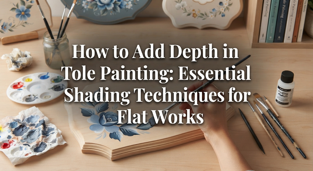
The most important and indispensable technique for creating depth in tole painting is "Floating" (also known as Side Loading). This is a technique using a flat or angular brush to create a smooth gradient in a single brushstroke.
Floating is a method where you load paint onto only one corner or edge of the brush, while the rest of the brush holds only water (or medium). This creates a beautiful gradient where the color is concentrated on the paint side and naturally fades into transparency toward the opposite side.
Using this technique allows you to easily create natural shading that seamlessly melts from dark shadows into the base color.
Here are the exact steps to execute a beautiful float. Doing this carelessly can lead to mistakes, so follow each movement thoughtfully.
The key takeaway is "blending on the palette." Never take paint on your brush and apply it directly to your piece right away! Blend it back and forth on the palette first to disperse the paint into the bristles, creating a gradient before touching the painting surface.
Controlling moisture is where beginners struggle the most. If there is too much water in the brush, puddles will form on the board and cause the paint to bleed. On the other hand, if there is too little water, the paint will dry out and scratch, preventing a smooth gradient.
A good rule of thumb after dipping your brush in water is to gently tap the belly of the brush twice on a folded paper towel. Aim for a state where water does not drip, but the bristles stay moist and gathered together. Learn this ideal moisture level through practice and feel.
If you find it difficult to manage with water alone, using commercially available Floating Medium or Retarder is a reliable solution. These slow down drying time compared to water and significantly improve paint flow, allowing beginners to create smooth blends without feeling rushed.
Once you have learned floating, try incorporating these advanced techniques to elevate the texture and quality of your work. Using them in the right situations will instantly broaden your artistic expression.
Double loading is a technique where you load two different colors onto opposite sides of a flat brush. For example, if you pick up pink on one side and white on the other to paint a flower petal, a single stroke completes a dimensional petal that is white on the outer edge and deeper pink in the center.
Because you can express light, shadow, or color shifts simultaneously with just a brush movement, it is an essential technique for painting leaves, ribbons, and petals.
Drybrushing, as the name suggests, is a technique where you gently rub a tiny amount of paint using a completely dry, stiff round brush or stencil brush.
After picking up a small amount of paint on your brush, wipe almost all of it off on a paper towel. Once the brush feels dry to the point where you wonder, "Will this even leave any color?", gently rub it in small circular motions over the center area where you want to add volume.
This technique is perfect for creating soft, borderless dimension—such as the rounded highlights on fruits, the fluffy fur of a teddy bear, or subtle blush on cheeks.
This technique involves thinning paint with plenty of water or clear medium to apply transparent layers over underlying colors.
By layering thin transparent color over previously painted highlights and shadows, you can unify the overall color tone or deepen shadows further. Layering multiple sheer coats rather than applying a heavy dark color all at once creates a rich, oil-painting-like depth.
When creating depth, the most important thing to watch out for is color selection. This is where many people misunderstand the process and accidentally ruin their work.
Thinking "It's a shadow, so mixing in black will make it darker" is a classic mistake beginners make. Adding black to your base color doesn't just make it darker—it drastically drops the saturation, turning the color muddy.
For example, if you mix black into a vibrant red to paint a shadow, it turns into a dirty brown or dull gray, instantly destroying the freshness of the subject.
When mixing shadow colors, strictly follow these rules:
By using deep, rich colors rather than black, you can render clean, lively shadows.
The same principle applies to highlights. Placing Titanium White (pure white) directly onto any motif creates an unnaturally stark, floating appearance.
For highlights, start by applying a lighter shade made by mixing a bit of white into the base color over a slightly broader area. Save pure white for the very end, placing it as a tiny focal point on the absolute highest point of reflection. Step-by-step brightening is the golden rule for natural gloss and volume.
Here are specific points for adding depth to popular motifs frequently painted in tole painting.
When painting spherical objects like apples, keeping reflected light in mind will instantly give your work a professional finish.
Instead of running a dark shadow all the way to the absolute edge of the sphere, leave a tiny sliver of lighter color or reflected light right along the outer rim beyond the shadow. Expressing light bouncing off a desk or floor emphasizes the roundness of the object, making it pop off the background.
When painting flowers, always work from the background petals forward. Then, place a rich, dark shade directly underneath where the front petal overlaps the rear one.
Adding this drop shadow creates spatial distance between front and back layers. For leaves, add shading toward the central vein and highlights on the leaf tips or curled edges to give them lively, wind-swept movement.
For ribbons, the shadows in twists and folds are key. Drop deep shadows into the inner, flipped-over parts of the ribbon, and place crisp, thin highlights along the peak of curves coming forward.
By balancing soft blurred shading with crisp edges, you can realistically portray the soft texture of fabric.
Many crafters feel that even if they understand the theory, their hand doesn't cooperate when holding the brush. When I first started tole painting, I struggled constantly with water ratios and had to repaint boards over and over again.
If I were to start practicing depth from scratch today, I wouldn't paint directly on a nice wood piece intended for a final project. Instead, I would use the back of a clean milk carton, an acrylic sheet, or an inexpensive practice board from a 100-yen craft store.
Rather than painting a whole pattern, I would repeat just one exercise: "Paint a simple circle, then practice adding shade and highlight to turn it into a sphere." Loading paint and water onto a flat brush, blending on the palette, and smoothly guiding the brush along the curve of the circle—focusing entirely on this motion until muscle memory takes over is the fastest shortcut.
The wonderful thing about acrylic paint is that once it completely dries, you can repaint the base color and try again as many times as you like. There's no need to panic over mistakes. Don't fear adjusting water levels or gradients; simply enjoy the process of learning paint and brush control!
Let's recap the key points for creating 3D depth in tole painting:
The moment proper light and shadow enter a flat painting, the motif suddenly springs to life as if taking a breath—that is the most thrilling moment in tole painting!
Adjusting brush moisture can be tricky at first, but take your time and build each gradient patiently. I sincerely hope to see rich, captivating works flow from your hands!
If you enjoyed this article, I would be so grateful if you shared it with your craft friends on social media or messaging apps!
Until next time, see you in the next article! This was Yassy from Crafters!






For example, if you are looking for articles about mizuhiki, try searching for "mizuhiki"; if you are interested in tools, try keywords like "nippers" or "pliers."